Recent release of new major version
Today’s topics
Headings
Patterns & gradients
Delayed evaluation
Polar coordinates
Facets
Headings
Better default titles for variables
Column metadata
Data dictionary
‘Pretty labels’ implemented as "label" attribute in columns.
Implemented in Hmisc, tinylabels, haven, labelled & sjlabelled
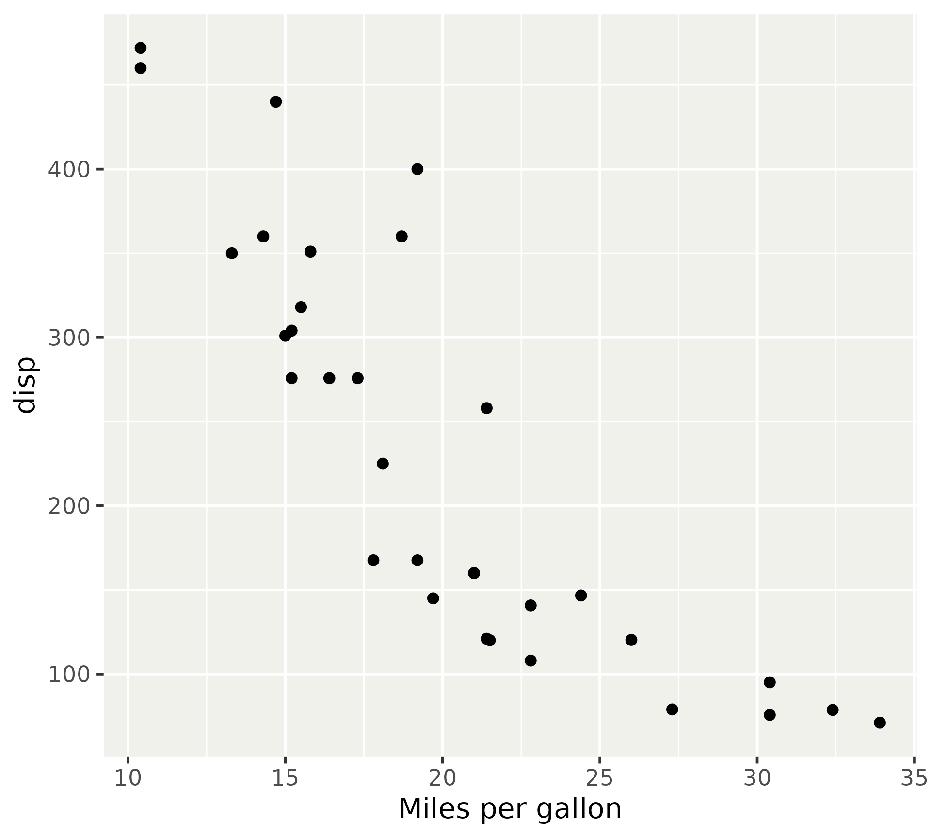
<- mtcars$ mpg <- haven:: labelled (df$ mpg, label = "Miles per gallon" )head (df$ mpg)## <labelled<double>[6]>: Miles per gallon ## [1] 21.0 21.0 22.8 21.4 18.7 18.1 attr (df$ mpg, "label" )## [1] "Miles per gallon"
‘Pretty labels’ implemented as "label" attribute in columns.
Implemented in Hmisc, tinylabels, haven, labelled & sjlabelled
Careful with label attribute stability
<- mtcarsattr (df$ mpg, "label" ) <- "Miles per gallon" head (df$ mpg)## [1] 21.0 21.0 22.8 21.4 18.7 18.1 :: vec_slice (df$ mpg, 1 : 6 )## [1] 21.0 21.0 22.8 21.4 18.7 18.1 ## attr(,"label") ## [1] "Miles per gallon"
Label attribute automatically detected.
library (ggplot2)library (patchwork)<- mtcarsattr (df$ mpg, "label" ) <- "Miles per gallon" ggplot (df, aes (mpg, disp)) + geom_point ()
Data dictionary
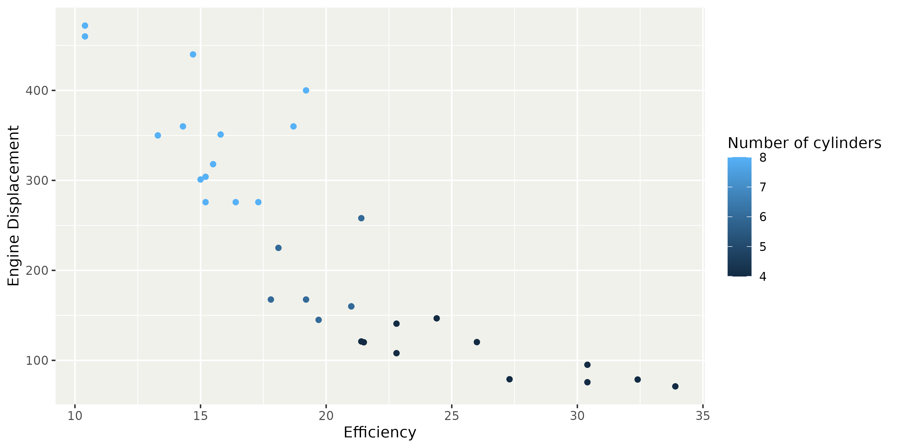
Example dictionary for mtcars
<- tibble:: tribble (~ column, ~ label, ~ unit, ~ note,"mpg" , "Efficiency" , "mi/gal" , "Gallons are US gallons" ,"cyl" , "Number of cylinders" , "" , "" ,"disp" , "Engine Displacement" , "in^3" , "" ,"am" , "Transmission" , "" , "0 = automatic, 1 = manual" # Additional rows for the other variables
# A tibble: 4 × 4
  column label               unit     note
  <chr>  <chr>               <chr>    <chr>
1 mpg    Efficiency          "mi/gal" "Gallons are US gallons"
2 cyl    Number of cylinders ""       ""
3 disp   Engine Displacement "in^3"   ""
4 am     Transmission        ""       "0 = automatic, 1 = manual"
Data dictionary
Preparing the dictionary for ggplot2 labels
# Format label as named vector <- setNames (dict$ label, dict$ column)# or: <- dplyr:: pull (dict, label, name = column)## mpg cyl disp ## "Efficiency" "Number of cylinders" "Engine Displacement" ## am ## "Transmission"
Data dictionary
ggplot (mtcars, aes (mpg, disp, colour = cyl)) + geom_point () + labs (dictionary = named_vec)
Pros
Label variables directly, rather than aesthetics
Rewards habit of annotating data
Reusable within document
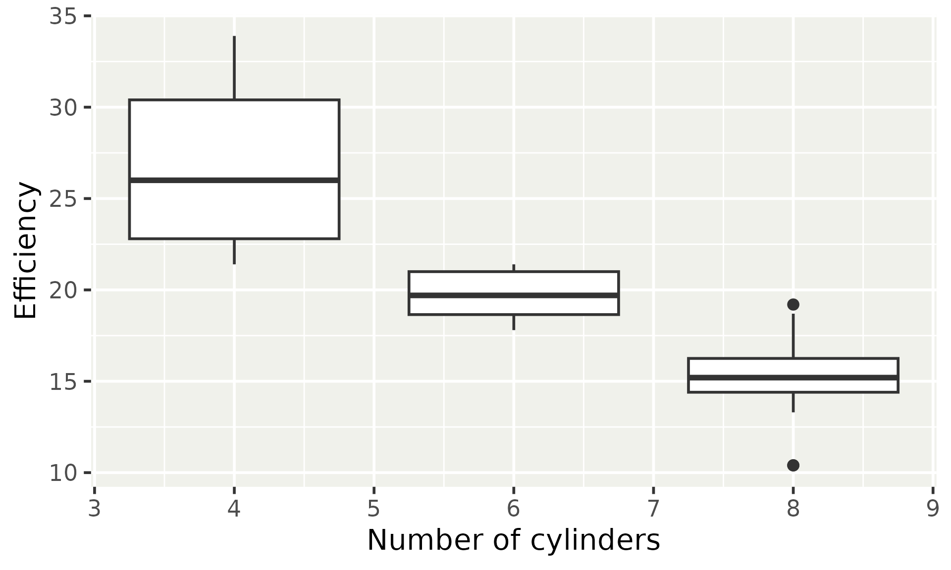
ggplot (mtcars, aes (cyl, mpg, group = cyl)) + geom_boxplot () + labs (dictionary = named_vec)
Pros
Label variables directly, rather than aesthetics
Rewards habit of annotating data
Reusable within document
Cons
Extra effort for ‘naked’ data
Expressions like factor(cyl) or cyl + 1 do not get automatic labels
Headings: summary
attr(data$var, "label")labs(dictionary)
Patterns and gradients
In R 4.1 the grid package introduced patterns and gradients.
grid::linearGradient()grid::radialGradient()grid::pattern()
We allow these as fill aesthetic in ggplot2.
Gradients
Simple examples of linear and radial gradients.
# A vector of 15 colours <- rev (hcl.colors (15 , "Sunset" ))library (grid)<- linearGradient (colours = colours,# Parametrised like a rectangle x1 = 0.5 , x2 = 0.5 ,y1 = 0.0 , y2 = 1.0 <- radialGradient (colours = colours, # Parametrised like two circles cx1 = 0.8 , cy1 = 0.8 , r1 = 0.2 ,cx2 = 0.5 , cy2 = 0.5 , r2 = 0.5 ,# Draw separately for every area group = FALSE
Gradients
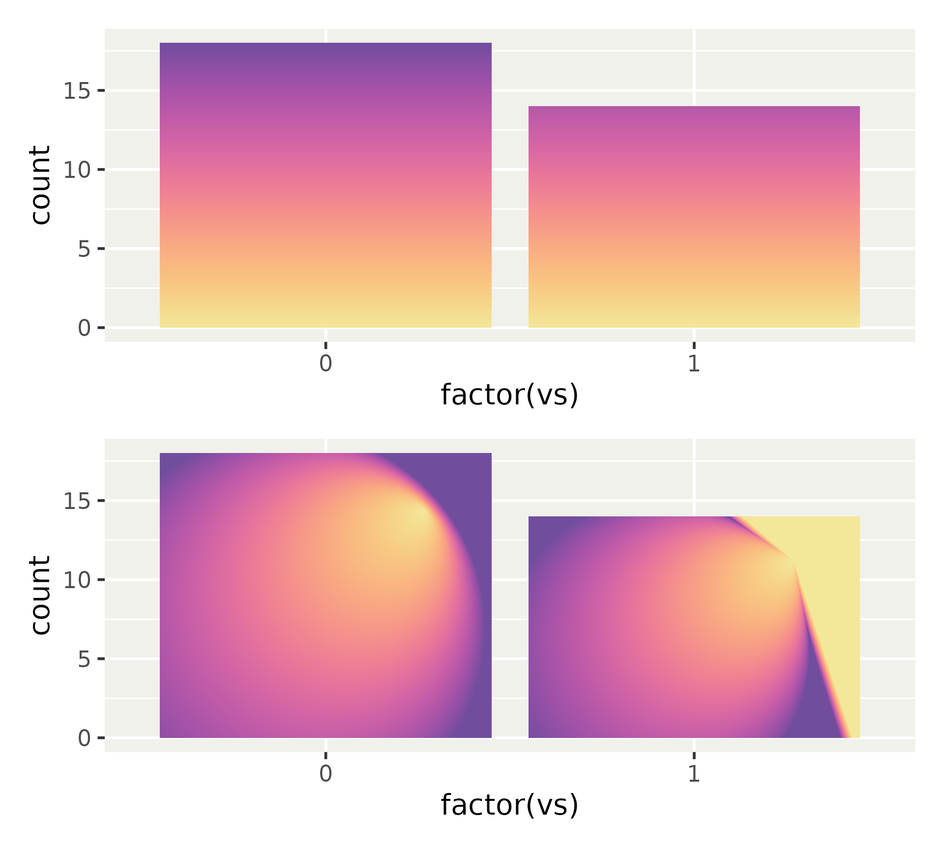
Use these gradients by providing them as a list.
<- ggplot (mtcars) + aes (factor (vs))<- p + geom_bar (fill = list (linear))<- p + geom_bar (fill = list (radial))/ p2
Ribbon gradient
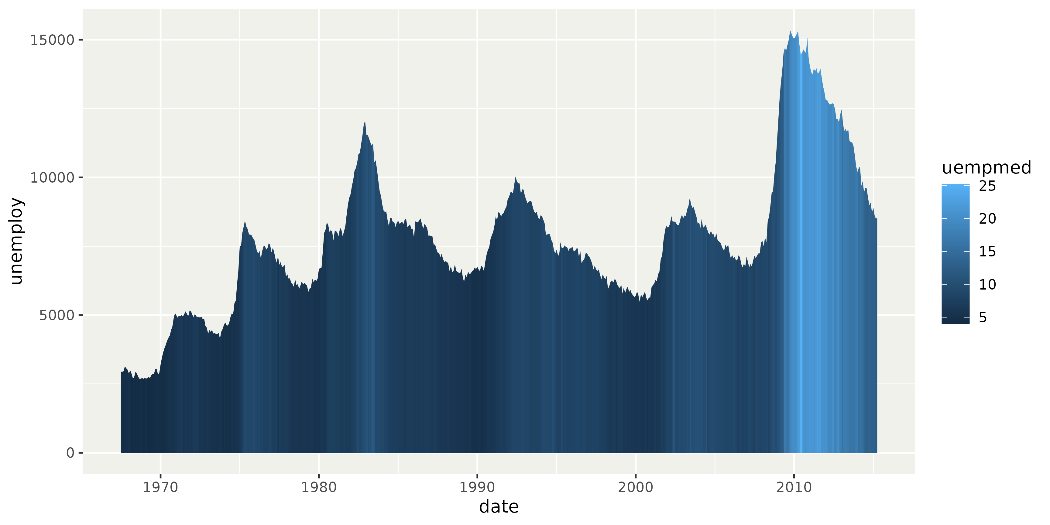
Ribbon geometries now render a varying fill aesthetic as a gradient.
ggplot (economics) + aes (date, unemploy, fill = uempmed) + geom_area ()
Patterns
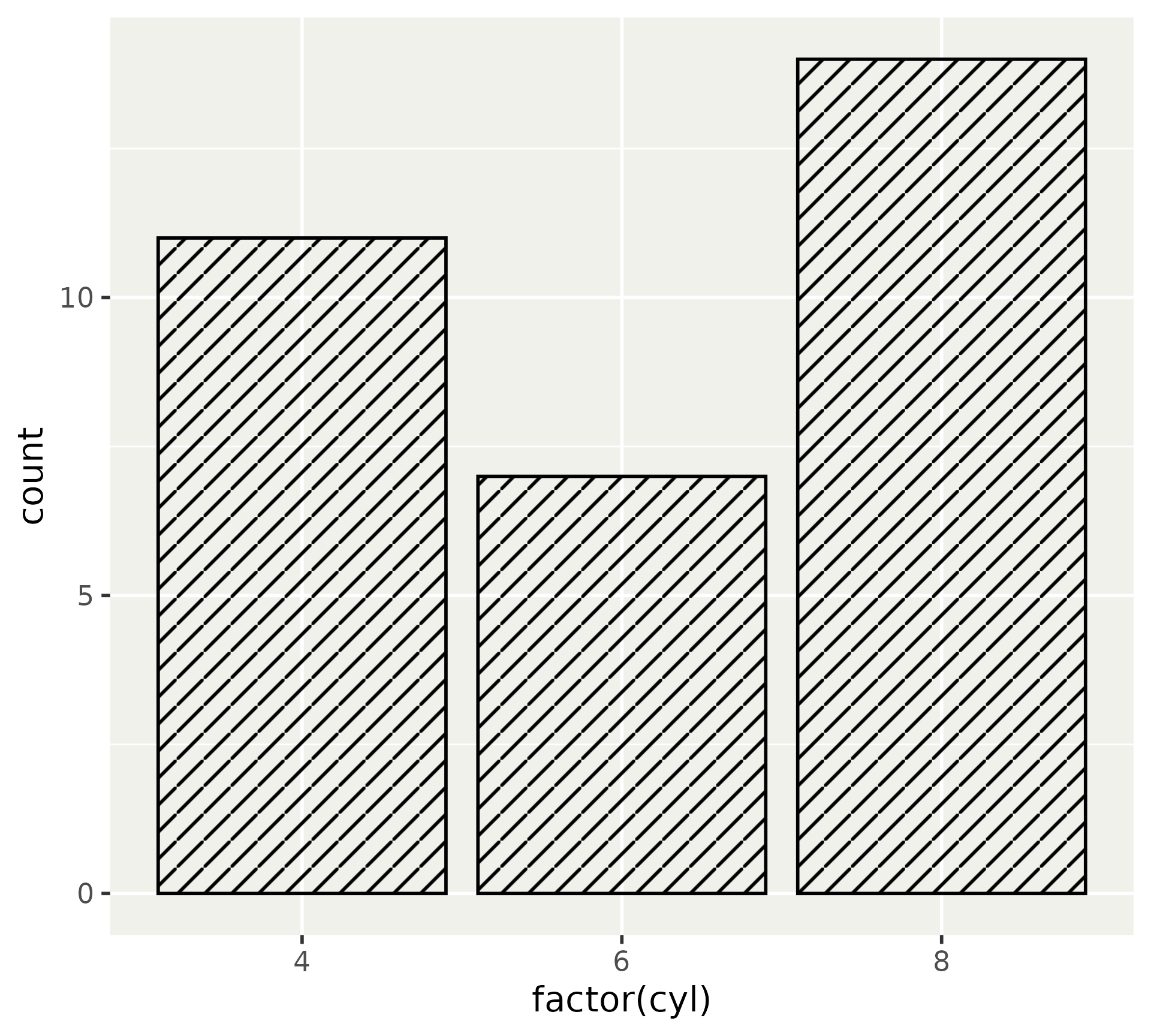
Patterns are more complicated. You may need to know a little bit of grid to get these right. Here we’re using a diagonal line as a pattern.
<- height <- unit (3 , "mm" )<- segmentsGrob (# Diagonal line x0 = 0 , x1 = 1 ,y0 = 0 , y1 = 1 ,gp = gpar (col = "black" ),vp = viewport (width = width, height = height)<- pattern (width = width, height = height,extend = "repeat"
Patterns
Like gradients, patterns can be given as a list.
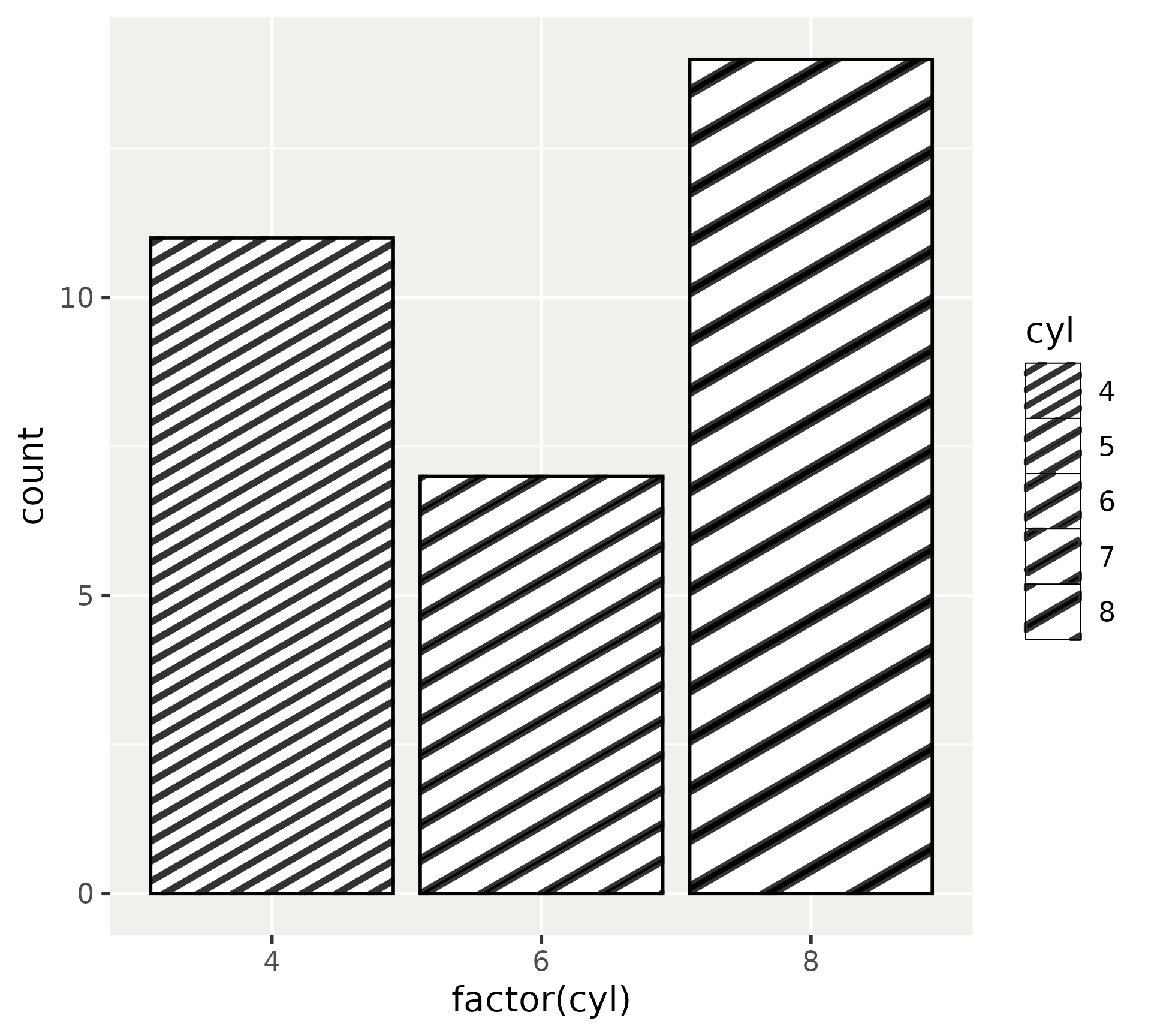
ggplot (mtcars) + aes (factor (cyl)) + geom_bar (fill = list (hatching),colour = "black"
Patterns
To ‘fix’ patterning artefacts, you may need to adjust the strokes in the inner drawing.
<- height <- unit (3 , "mm" )<- segmentsGrob (x0 = c (- 1 , - 1 , 0 ), x1 = c (1 , 2 , 2 ),y0 = c (0 , - 1 , - 1 ), y1 = c (2 , 2 , 1 ),gp = gpar (col = "black" ),vp = viewport (width = width, height = height)<- pattern (width = width, height = height,extend = "repeat"
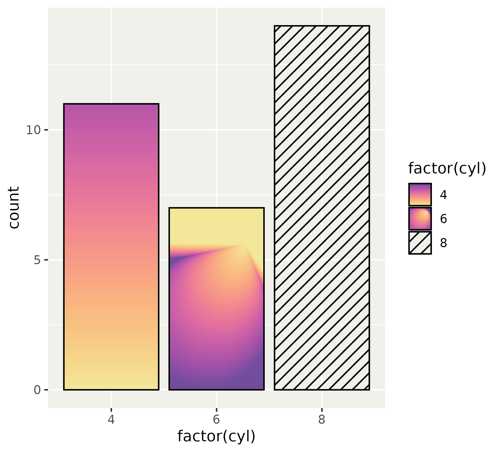
Patterns
Using patterns as a scale.
ggplot (mtcars) + aes (factor (cyl), fill = factor (cyl)) + geom_bar (colour = "black" ) + scale_fill_manual (values = list (linear, radial, hatching)
Patterns galore
Using the gridpattern package to easily generate patterns.
<- gridpattern:: patternFill (pattern = "polygon_tiling" ,type = "herringbone" ,spacing = 0.2 ,units = "cm" ,colour = "grey40" ,linewidth = 0.3 <- gridpattern:: patternFill (pattern = "polygon_tiling" ,type = "hexagonal" ,spacing = 0.2 ,units = "cm" ,colour = "grey40" ,linewidth = 0.3 <- gridpattern:: patternFill (pattern = "wave" ,spacing = 0.2 ,units = "cm" ,colour = "grey40" ,linewidth = 0.3
Patterns galore
Using the gridpattern package to easily generate patterns.
ggplot (mtcars) + aes (factor (cyl), fill = factor (cyl)) + geom_bar (colour = "grey40" ) + scale_fill_manual (values = list (herringbone, hexagons, waves)
Patterns galore
Parametrised patterns with the ggpattern package.
library (ggpattern)ggplot (mtcars) + aes (x = factor (cyl),pattern_spacing = cyl+ geom_bar_pattern (pattern_fill = "black" , colour = "black" , fill = "white" + scale_pattern_spacing_continuous (range = c (0.02 , 0.05 )
Patterns galore
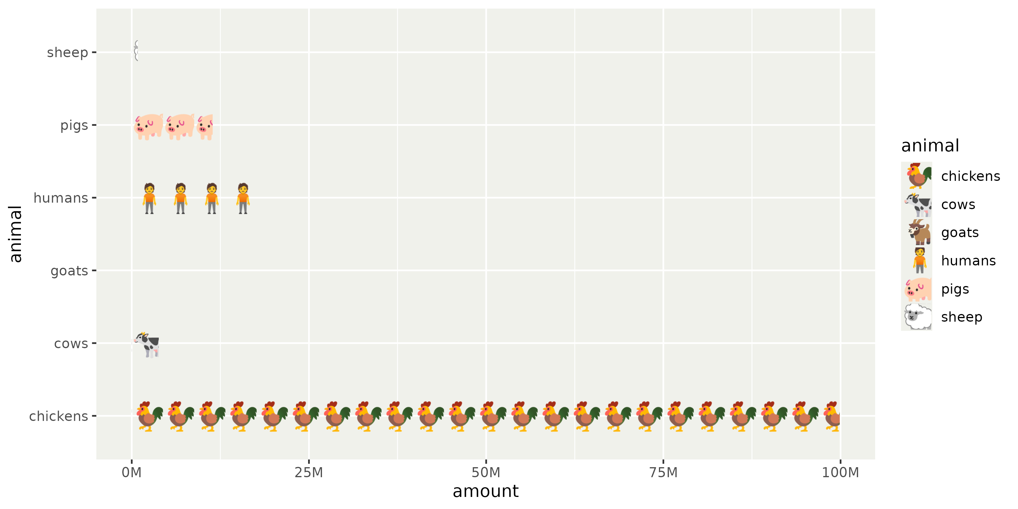
Emoji isotype plot using text patterns.
Code
# Helper function <- unit (20 , "pt" )<- function (text) {lapply (text, function (string) {<- textGrob (string, x = 0 , hjust = 0 , gp = gpar (fontsize = 18 ))pattern (x = 0 , hjust = 0 ,width = width, extend = "repeat" , # Center text per bar using height/group height = unit (1 , "npc" ),group = FALSE # Stats for the Netherlands <- data.frame (animal = c ("chickens" , "pigs" , "cows" , "sheep" , "goats" , "humans" ),amount = c (99900000 , 11400000 , 3800000 , 850000 , 480000 , 17990000 )ggplot (df, aes (amount, animal, fill = animal)) + geom_col () + scale_fill_manual (values = patternise_text (c ("chickens" = "🐓" ,"pigs" = "🐖" ,"cows" = "🐄" ,"sheep" = "🐑" ,"goats" = "🐐" ,"humans" = "🧍" + scale_x_continuous (labels = scales:: label_number (scale = 1e-6 , suffix = "M" )+ theme (legend.key.width = width,legend.key.height = unit (18 , "pt" ) # see fontsize in pattern
Patterns and gradients: summary
grid for most control over patterns.
grid::pattern(), grid::linearGradient(), grid::radialGradient() gridpattern for preformatted patterns.
gridpattern::patternFill() ggpattern for mapping data to patterns.
Aesthetics (pattern_density)
Geom layers (ggpattern::geom_boxplot_pattern())
Scales (ggpattern::scale_pattern_density_continuous())
Delayed evaluation
With regards to evaluation, there are three stages:
Direct input at start
After computing stat
After scale mapping
Data available from the start, when mapped from data columns.
✅ aes(x = displ, y = hwy)
❌ Unmapped aesthetics like geom_bar(fill = "red")
❌ Data columns that are not included in aes()
After computing stat
In addition to aesthetics, computed variables become available.
Section in e.g. ?stat_density
Accessible via after_stat()
Redirection in Stat*$default_aes
# Inspect default aesthetics $ default_aes
Aesthetic mapping:
* `x`      -> `after_stat(density)`
* `y`      -> `after_stat(density)`
* `fill`   -> NA
* `weight` -> NULL
After computing stat
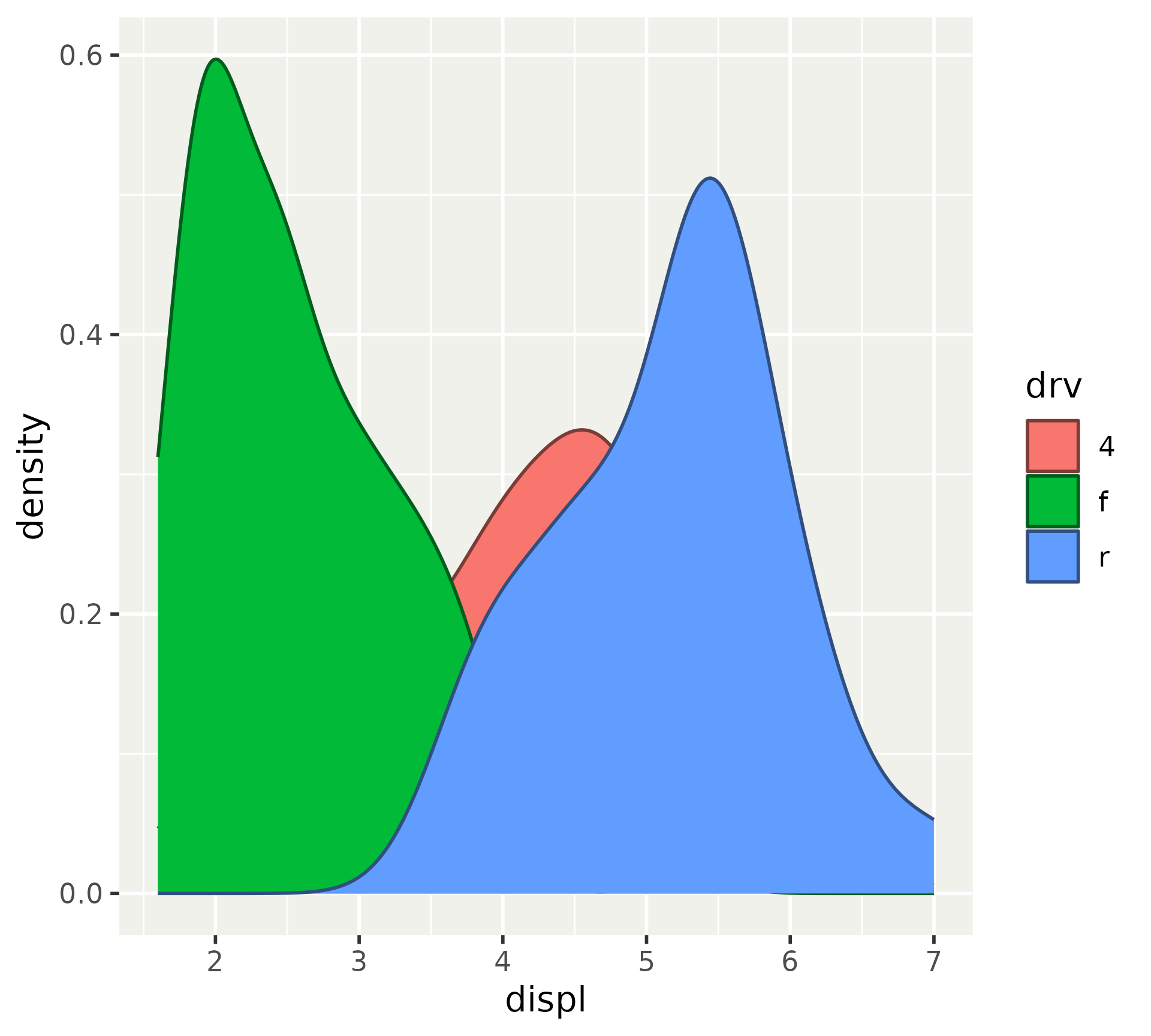
Using after_stat() yourself to redirect/modify computed variables.
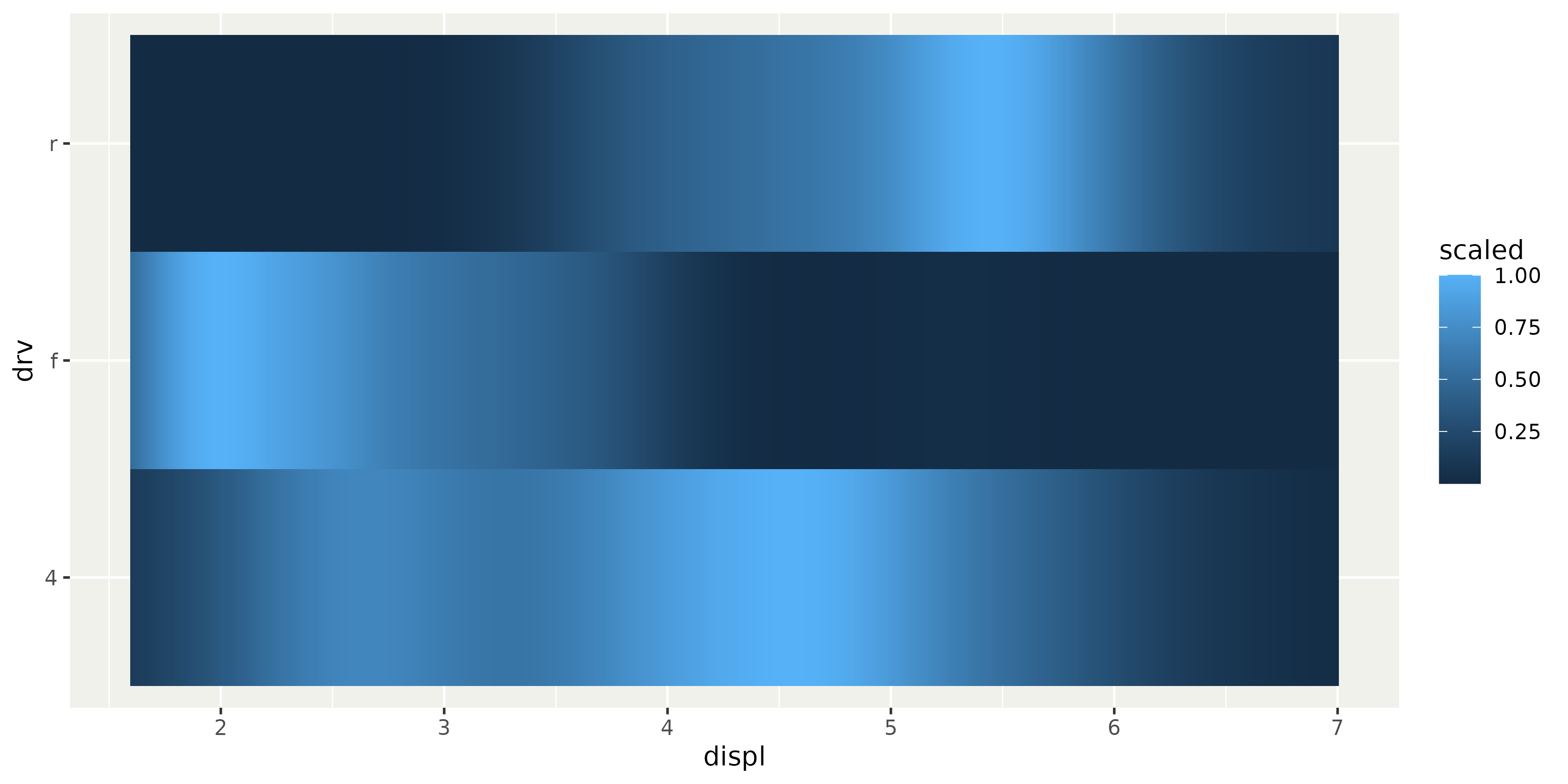
ggplot (mpg, aes (displ, drv)) + stat_density (geom = "tile" , position = "identity" ,aes (fill = after_stat (scaled))
After computing stat
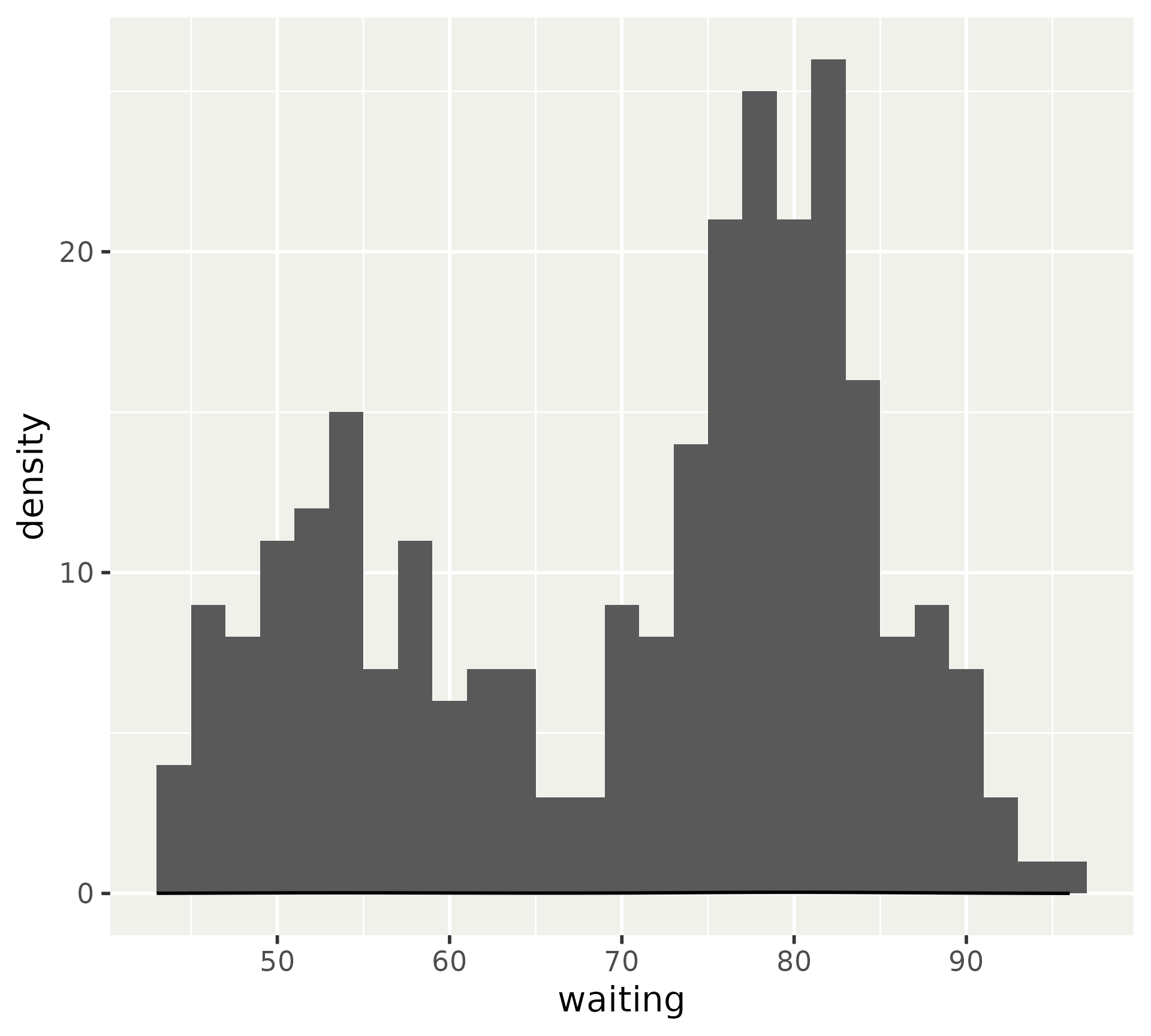
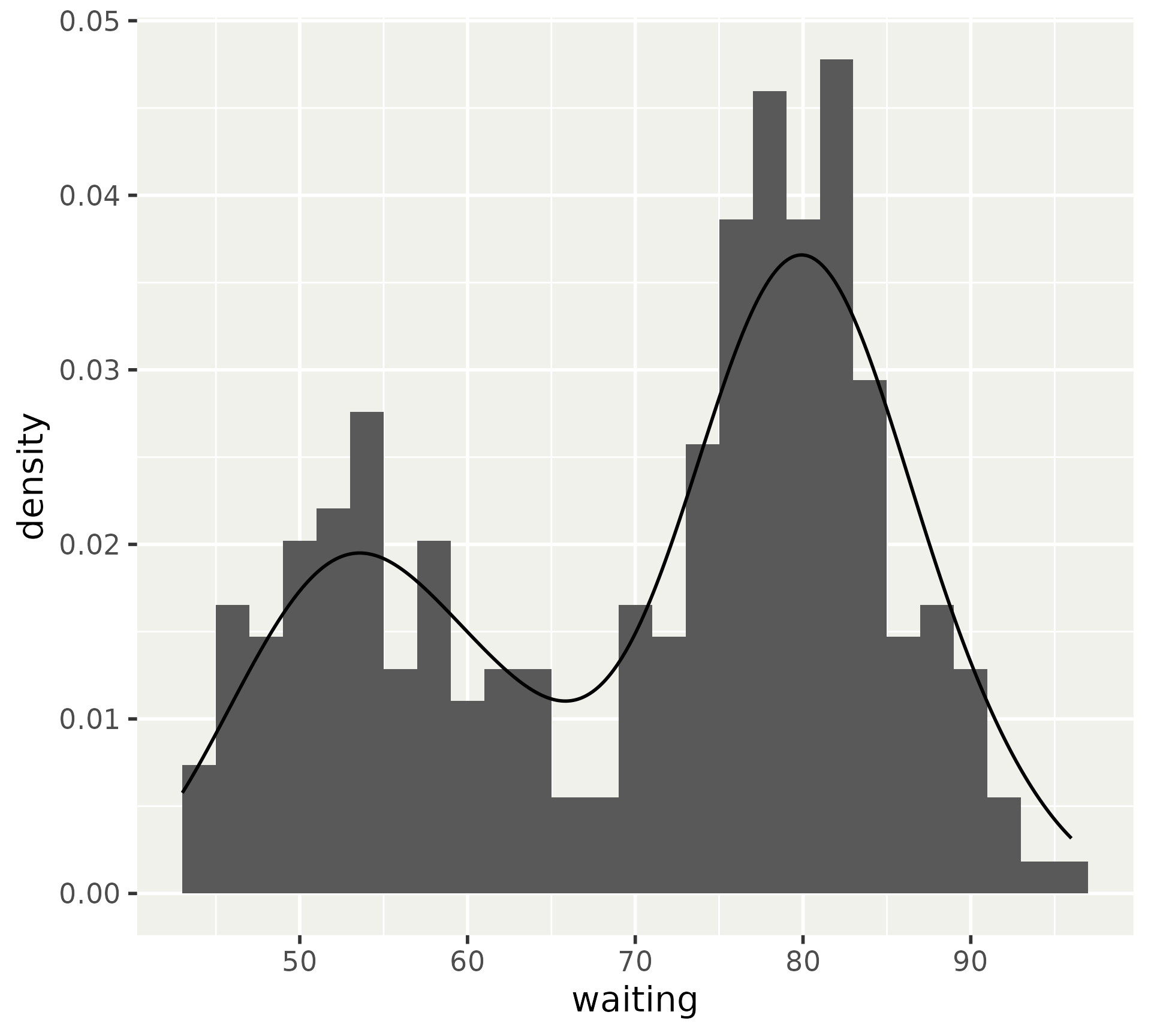
You may have run into a histogram/density misalignment problem.
<- 2 ggplot (faithful, aes (waiting)) + geom_histogram (binwidth = binwidth) + geom_density ()
After computing stat
This can be fixed by using the density computed variable in the histogram.
ggplot (faithful, aes (waiting)) + geom_histogram (aes (y = after_stat (density)), binwidth = binwidth+ geom_density ()
After computing stat
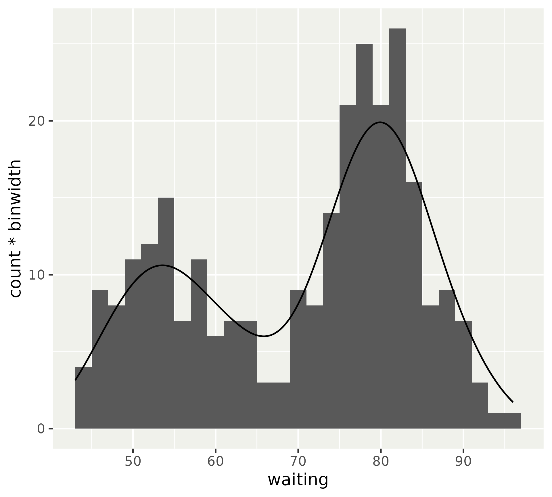
Or scaling the count computed variable in the density.
ggplot (faithful, aes (waiting)) + geom_histogram (binwidth = binwidth) + geom_density (aes (y = after_stat (count * binwidth))
After scales
At this stage in the plot, we have mapped variables .
Determined by scale’s palette
Values now have graphical interpretation
colour: "#4B0055"size: 12shape: "circle filled"/21linetype: "solid"/1
Access via after_scale()
After scales
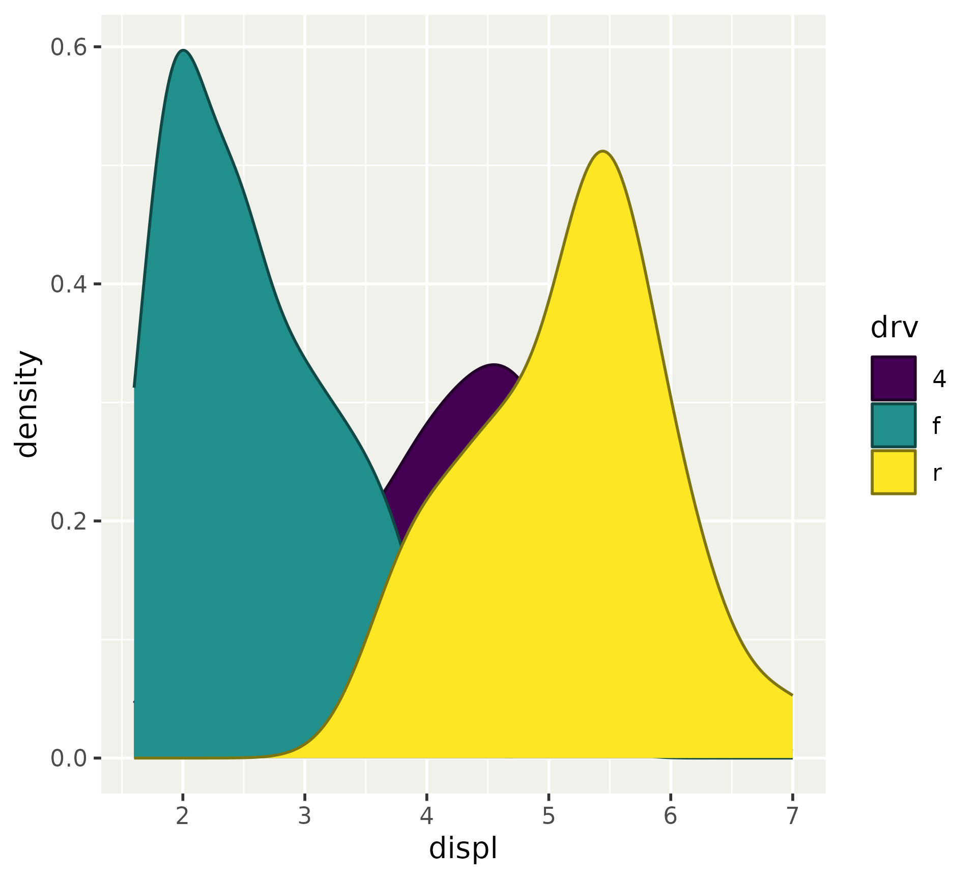
A typical use of after_scale() is to derive colours from colour to fill or vice versa.
ggplot (mpg, aes (displ, fill = drv)) + geom_density (aes (colour = after_scale (:: col_mix (fill, "black" )
After scales
A nice benefit of using after_scale() is that you derive colours, so you can still swap out scales.
last_plot () + scale_fill_viridis_d ()
After scales
Another use case can be to create half-geometries.
ggplot (mpg, aes (class, displ)) + geom_boxplot (aes (xmin = after_scale (x)), staplewidth = 0.3 ) + geom_violin (aes (xmax = after_scale (x)))
Staging
When you need a combination of direct input, after stat or after scale modifications, you can use stage().
stage(x) is equivalent to x.stage(after_stat = x) is equivalent to after_stat(x).stage(after_scale = x) is equivalent to after_scale(x).
Staging
A typical use case is when you want to initialise the aesthetic with one column, and later modify the mapped values.
ggplot (mpg, aes (drv, displ)) + geom_violin (aes (fill = stage (start = drv, after_scale = scales:: col_mix (fill, "white" )
Staging
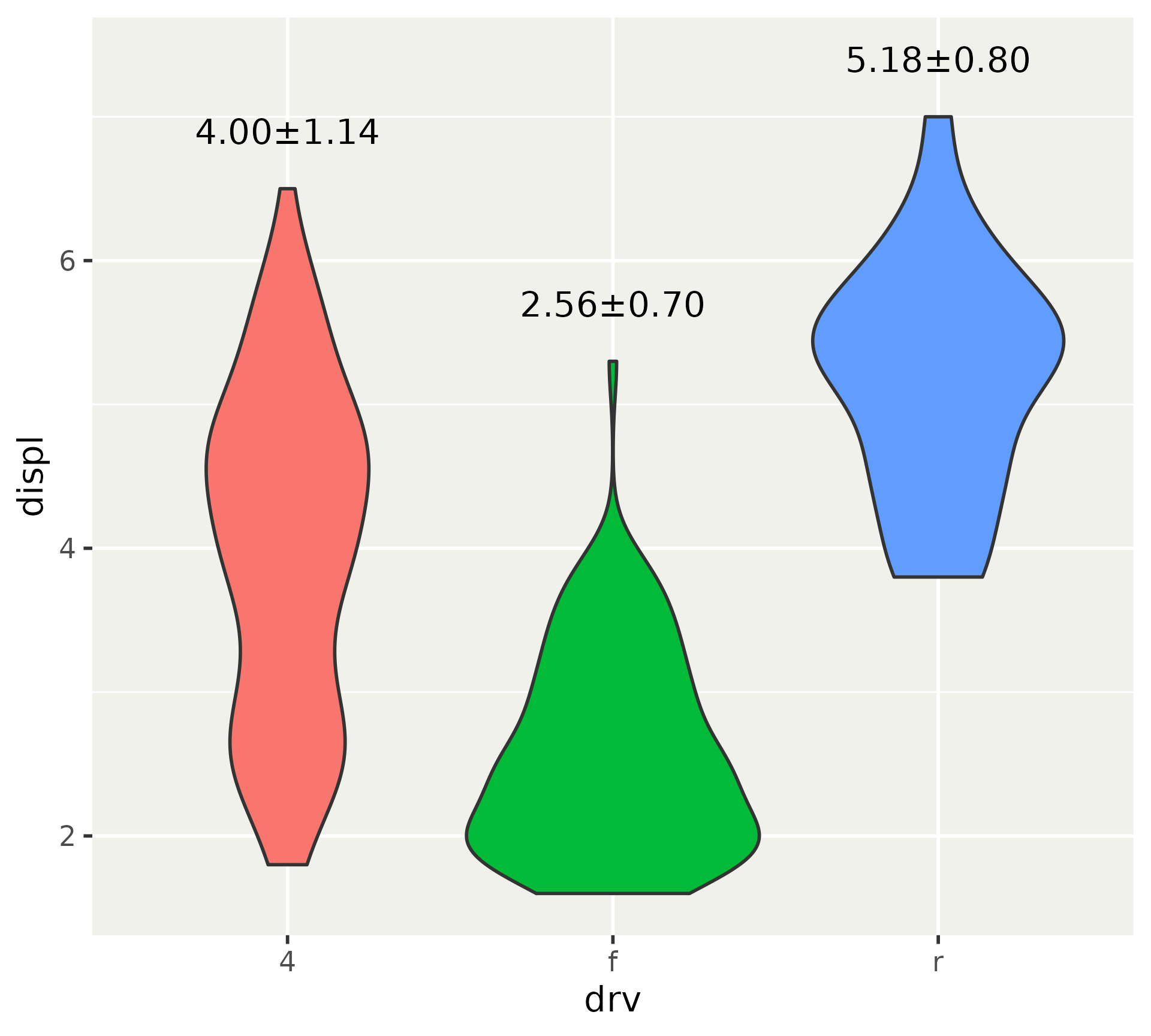
Another use case is to reposition labels after computing a statistic.
ggplot (mpg, aes (drv, displ, fill = drv)) + geom_violin (show.legend = FALSE ) + stat_summary (fun.data = ~ data.frame (mean = mean (.x), sd = sd (.x), max = max (.x)aes (y = stage (displ, after_stat = max + 0.4 ),label = after_stat (sprintf ("%.2f±%.2f" , mean, sd))geom = "text"
Caveat
Staging function on their own are inert.
after_stat (10 )## [1] 10 after_scale (10 )## [1] 10 stage (10 , "A" , mpg)## [1] 10
They need to be put in aes().
aes (a = after_stat (10 ),b = after_scale (10 ),c = stage (10 , "A" , mpg)## Aesthetic mapping: ## * `a` -> `after_stat(10)` ## * `b` -> `after_scale(10)` ## * `c` -> `stage(10, "A", mpg)`
Delayed evaluation: summary
after_stat() to access computed variables .
after_scale() to redirect mapped values .
stage() to initiate and delay modification.
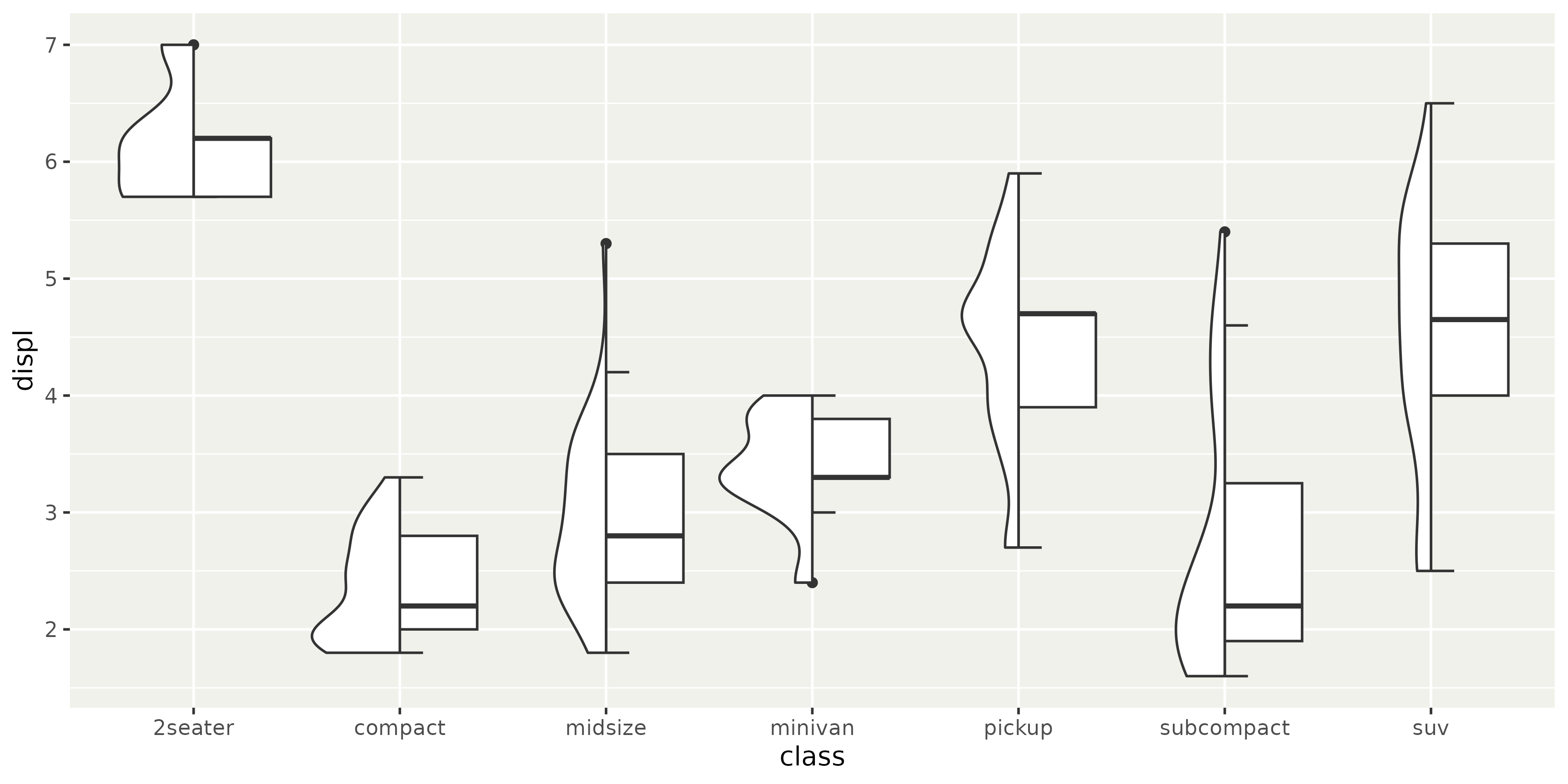
Polar coordinates
The classic coord_polar() is superseded by coord_radial().
expand parameterArbitrary sectors
Donuts
Polar coordinates
Helpful to always examine plot in Cartesian coordinates.
Code
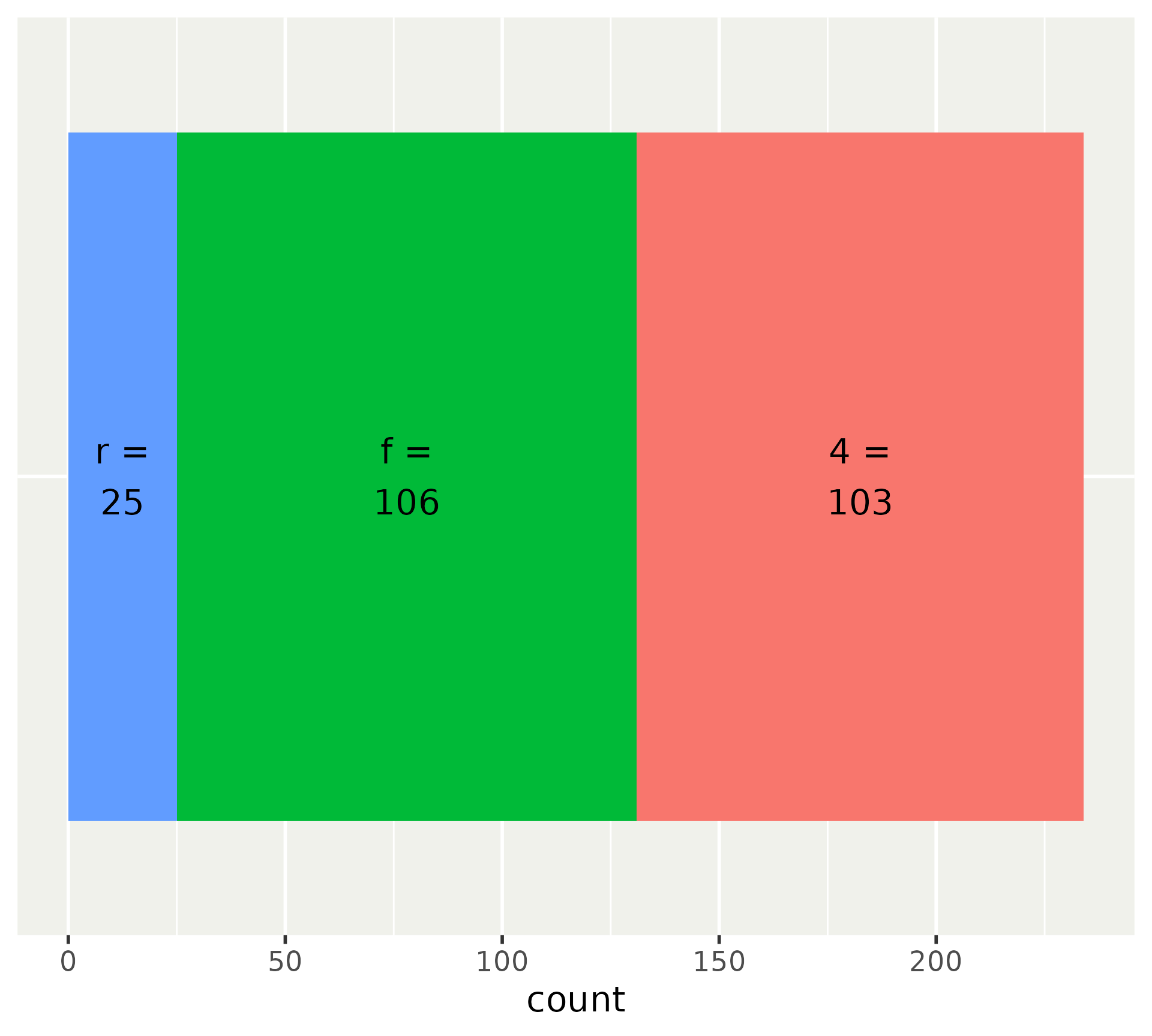
<- ggplot (mpg, aes (y = factor (1 ), fill = factor (drv))) + geom_bar () + # Add labels stat_count (aes (label = after_stat (paste0 (fill, " = \n " , count))),geom = "text" ,position = position_stack (vjust = 0.5 )+ # Turn off y-axis and legend scale_y_discrete (guide = "none" , name = NULL ) + scale_fill_discrete (guide = "none" )
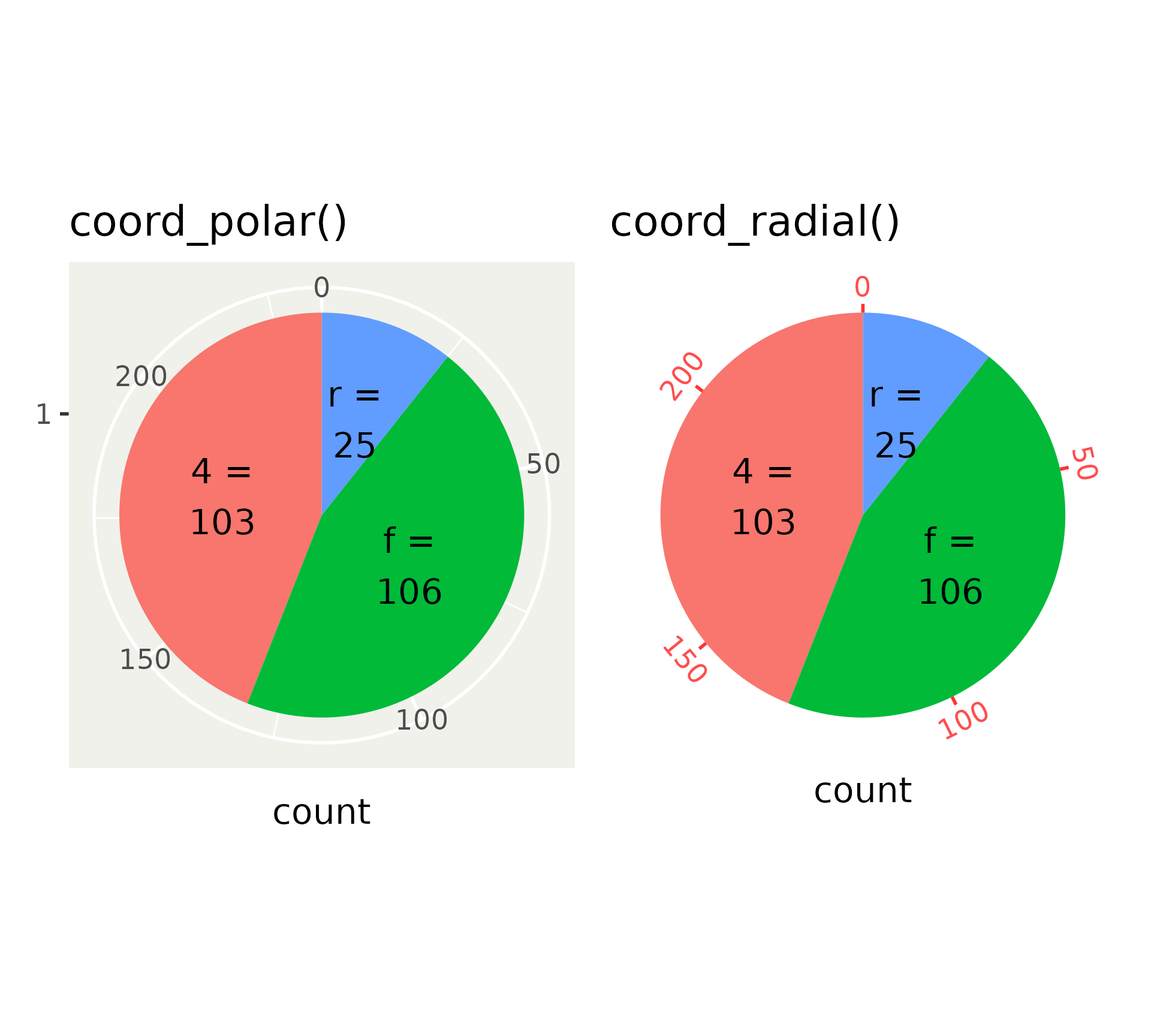
Polar versus radial
Differences between coord_polar() and coord_radial().
<- p + coord_polar () + labs (title = "coord_polar()" )<- p + coord_radial () + labs (title = "coord_radial()" )# Thomas will explain this here mystery later + radial
Polar versus radial
Set expand = FALSE for use in pie charts.
<- p + coord_polar () + labs (title = "coord_polar()" )<- p + coord_radial (expand = FALSE ) + labs (title = "coord_radial()" )+ radial
Polar axes
coord_radial() interfaces with guide system mostly via guide_axis_theta(). Also note the text angles.
<- scale_x_continuous (guide = guide_axis_theta (angle = 0 , theme = theme_gray (ink = "red" )# Ignores guide + red_axis) + # Uses correct guide + red_axis)
Partial circles
We’re no longer restricted to complete circles.
+ coord_radial (start = - 0.4 * pi, end = 0.4 * pi)
Partial circles
Switching a pie chart to a donut chart is as easy as setting the inner.radius argument.
+ coord_radial (expand = FALSE , inner.radius = 0.5
Partial circles
We can combine partial polar coordinates with donuts.
+ coord_radial (start = 0 , end = 0.5 * pi, inner.radius = 0.5
Polar coordinates: summary
coord_radial() replaces coord_polar()Partial circles: start & end
Donut: inner.radius
Facets
Display of inner axes
Layer layout
Panel ordering
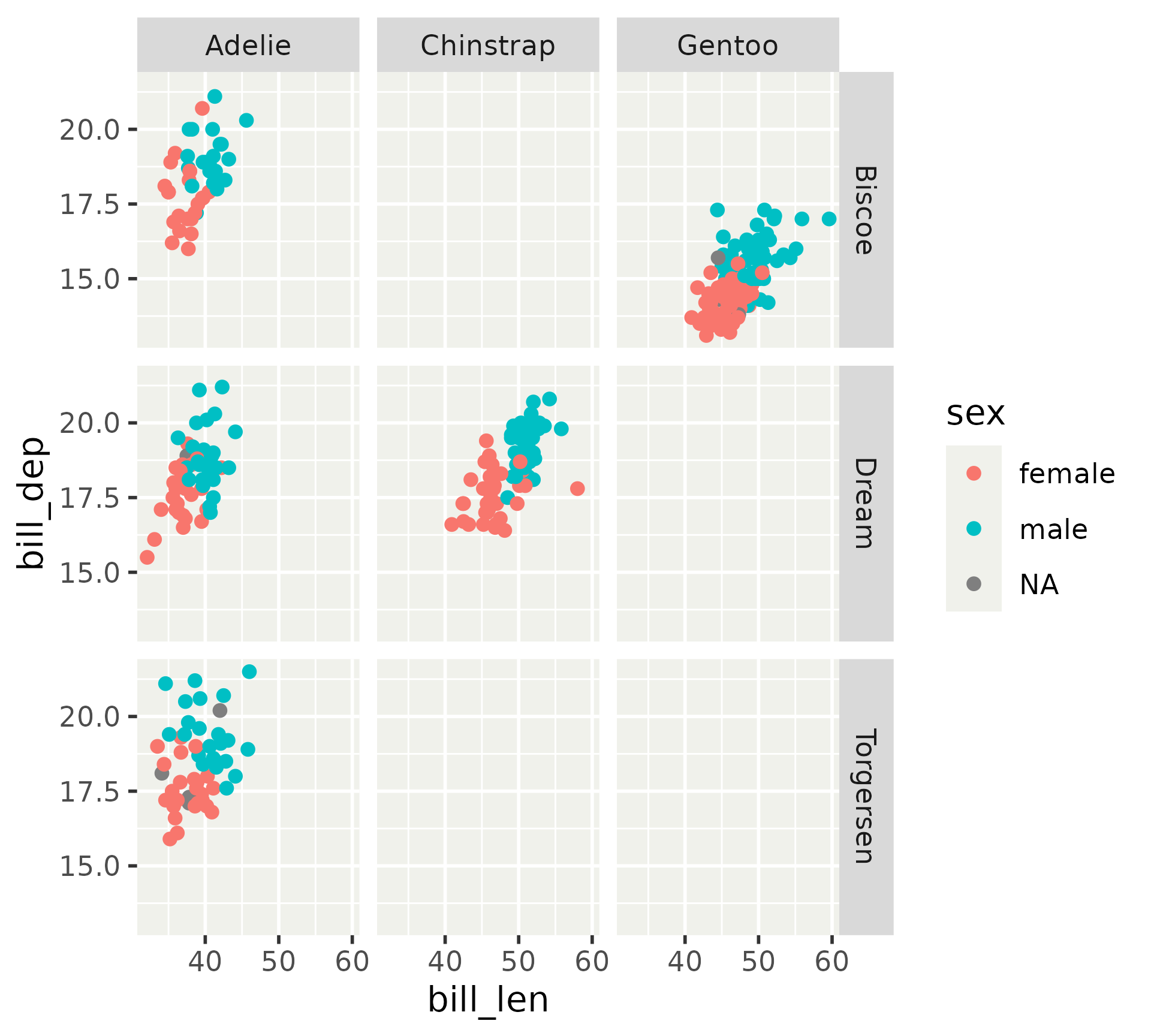
Display of inner axes
<- ggplot (penguins) + aes (bill_len, bill_dep, colour = sex) + geom_point (na.rm = TRUE )+ facet_grid (island ~ species)
Display of inner axes
Inner axes can be exposed, for all directions or x or y individually.
+ facet_grid (island ~ species, axes = "all" )
Display of inner axes
We can confine labels, so inner axes only display tick marks.
+ facet_grid (island ~ species, axes = "all" , axis.labels = "margins" )
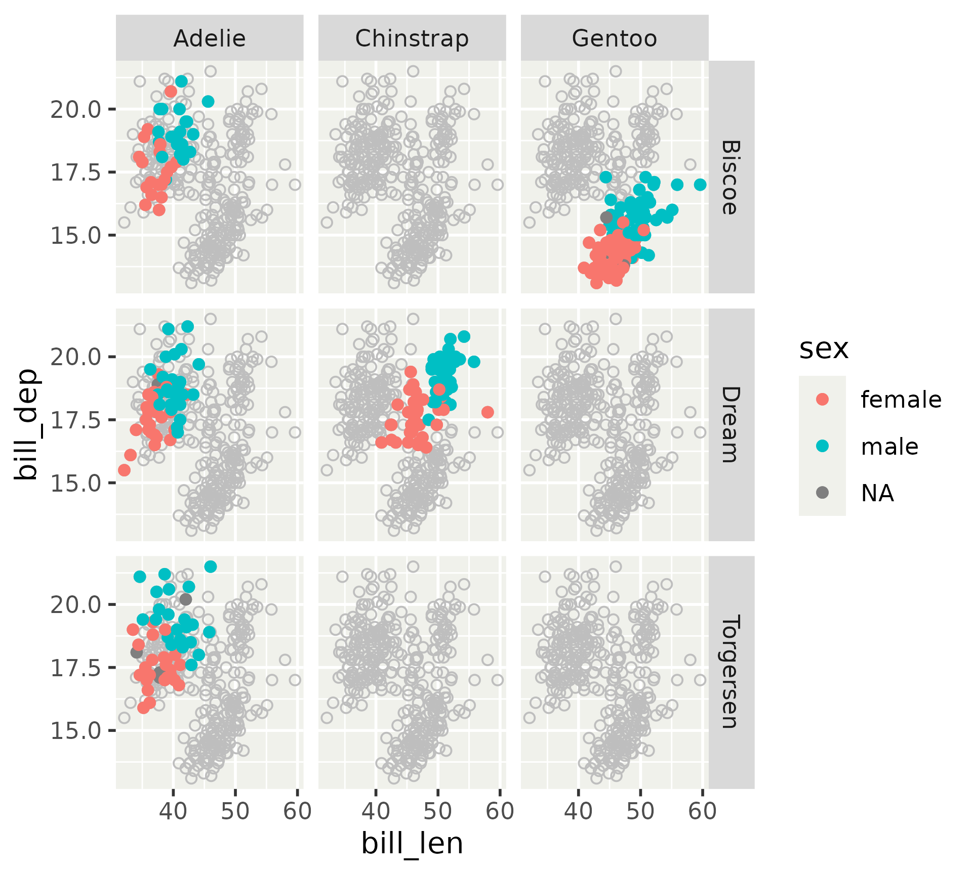
Layout
Layers have a layout argument that can be interpreted by facets.
+ geom_point (colour = "grey" , shape = 1 , na.rm = TRUE ,layout = "fixed" + geom_point (na.rm = TRUE ) + facet_grid (island ~ species)
Layout
facet_wrap() and facet_grid() allow placement at certain panels.
+ annotate (geom = "text" , x = I (0.7 ), y = I (0.25 ), size = 2 ,label = "Adelie Penguins \n on Dream island" ,layout = 4 + facet_grid (island ~ species)
Wrap panel order
New panel ordering settings in dir argument.
as.table is now absorbed in dirUse two-letter combination of t, r, b, l
t = topr = rightb = bottoml = left
Combinations determines starting point, e.g. "br" starts in the bottom-right.
First letter indicates growing direction, e.g. "br" grows bottom-to-top before right-to-left.
Wrap panel order
The default order is "lt".
<- ~ as.integer (interaction (species, island, drop = TRUE ))+ facet_wrap (panels, dir = "lt" )
Wrap panel order
+ facet_wrap (panels, dir = "tr" )
Facets: summary
Display of inner axes
axes = "margins"/"all"/"all_x"/"all_y"axis.labels = "all"/"margins"/"all_x"/"all_y"
layer(layout) argument
Repeat data across panels
Confine data to individual panels
facet_wrap(dir) sets panel layout
Two letter code determine start position
First letter determines growing direction