03:00
Quarto
Dashboards
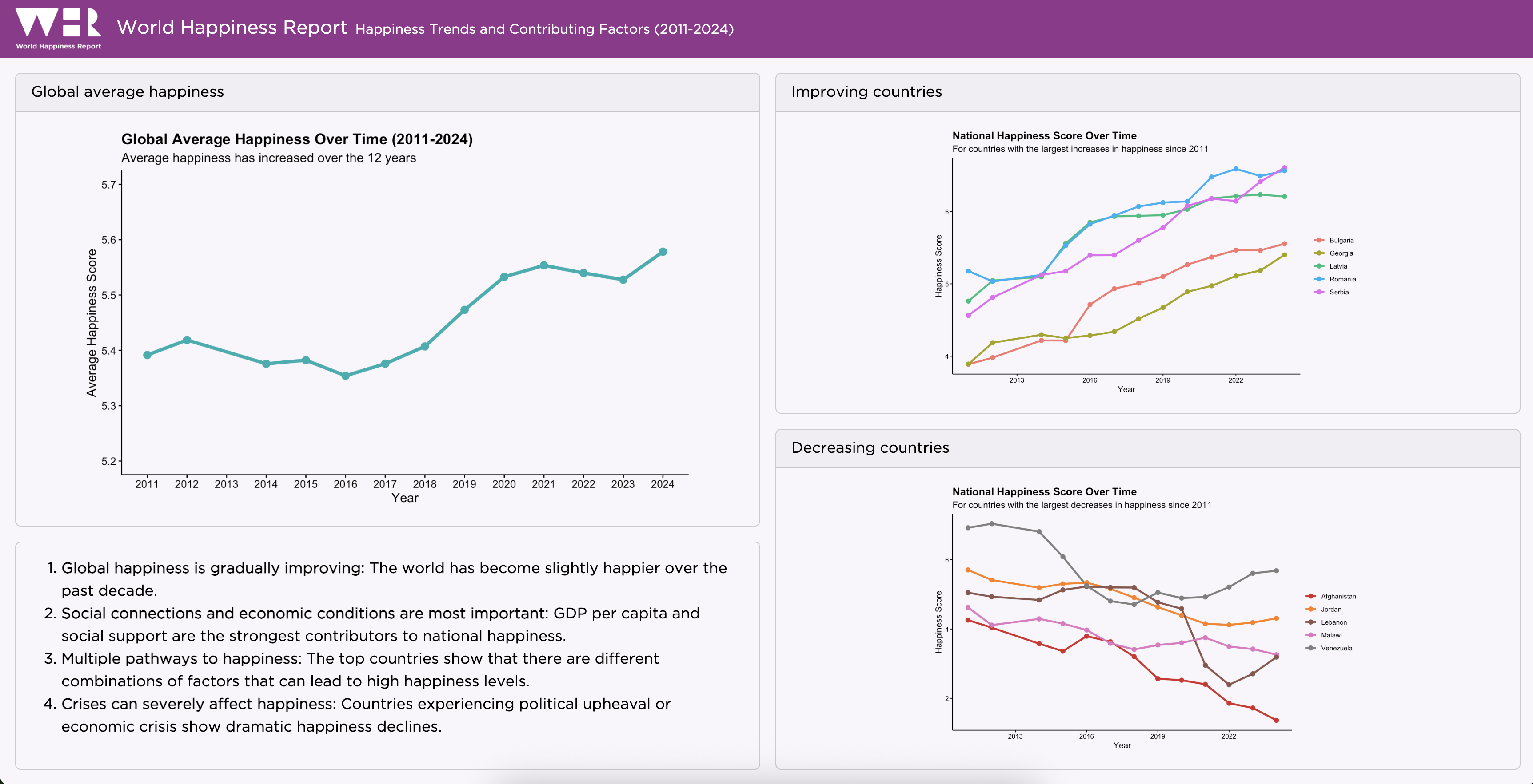
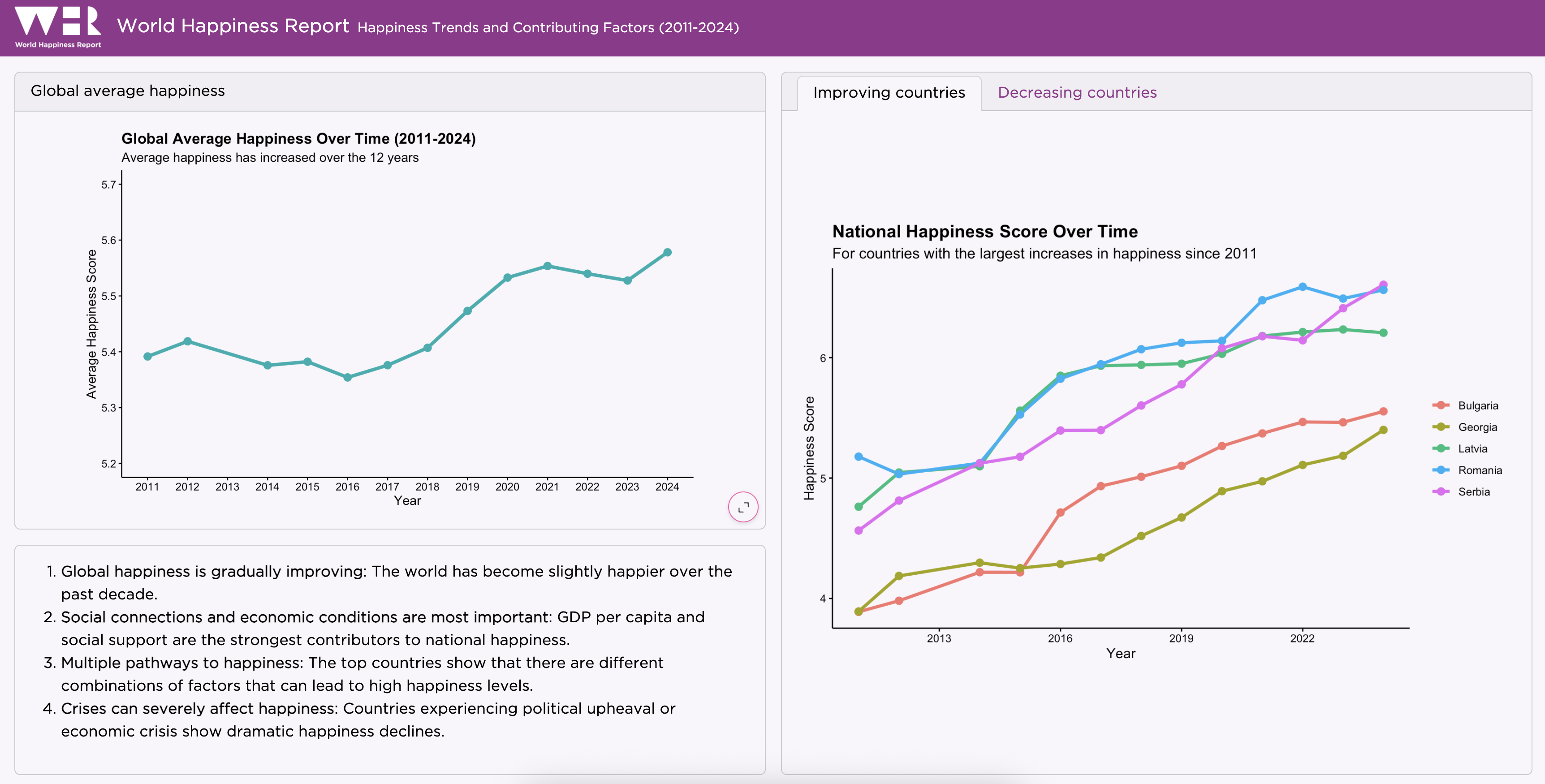
🌎 World Happiness Report dashboard
Step 2: Add a card
Step 3: Add another card
dashboard.qmd
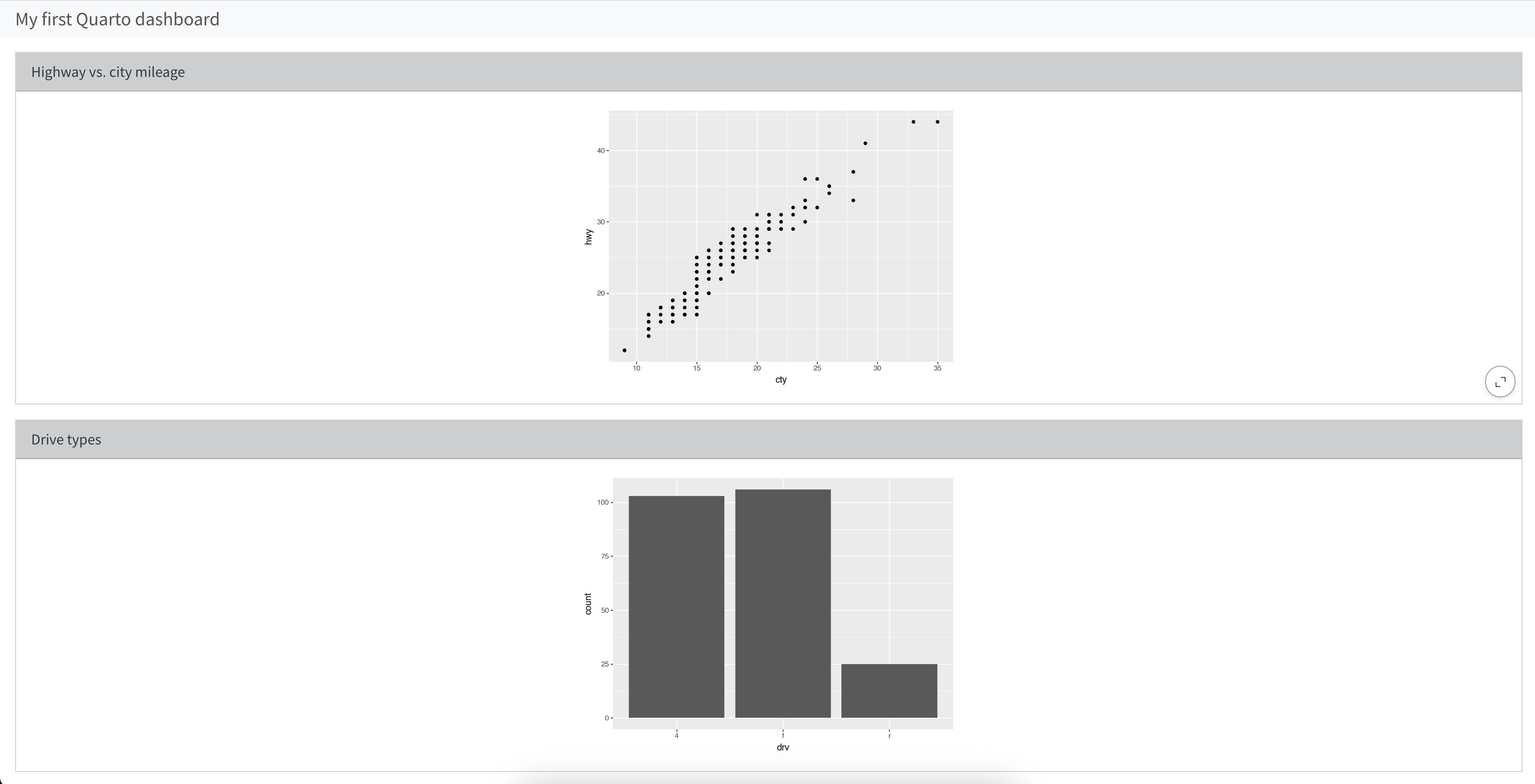
Step 4: Add titles to cards
dashboard.qmd
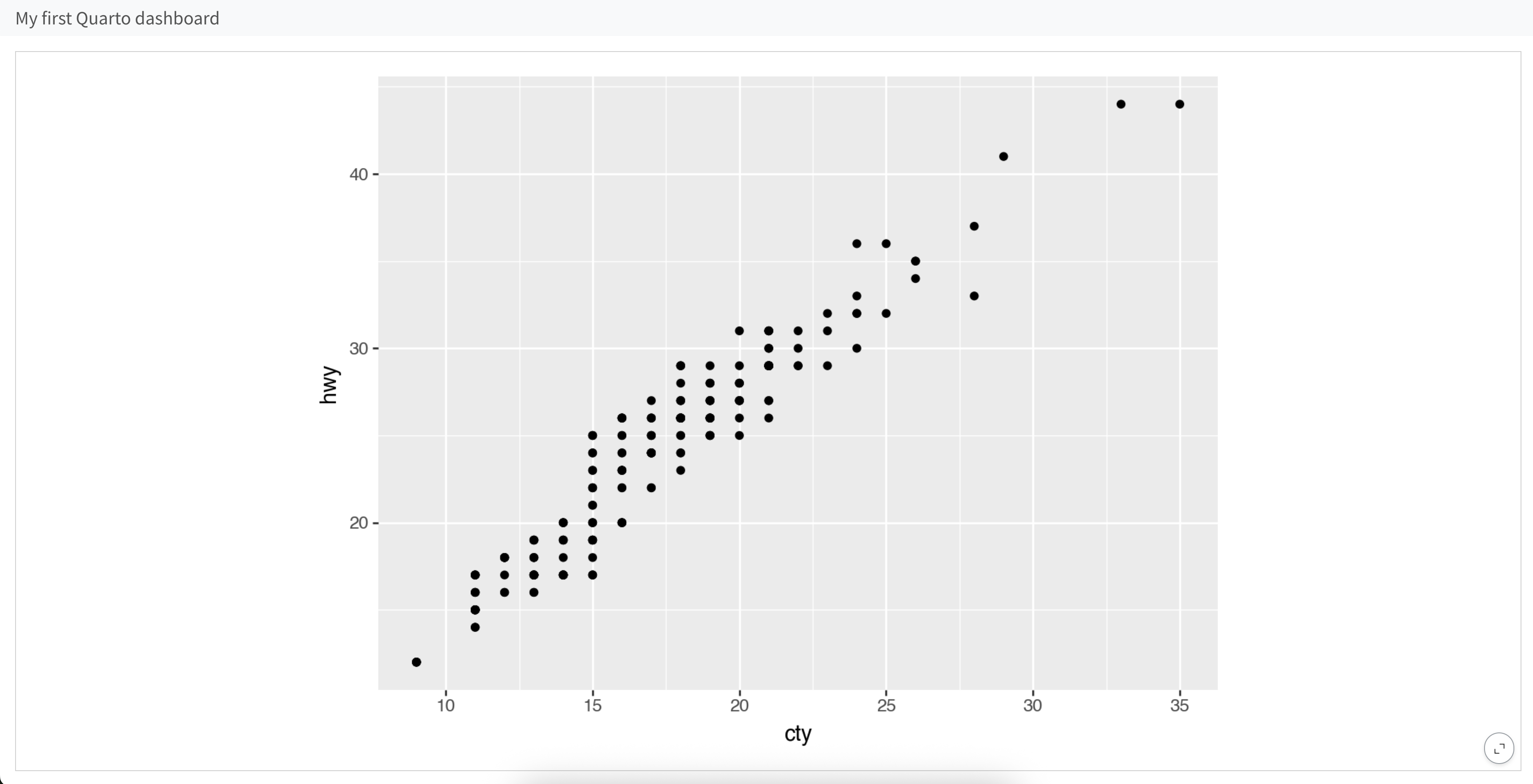
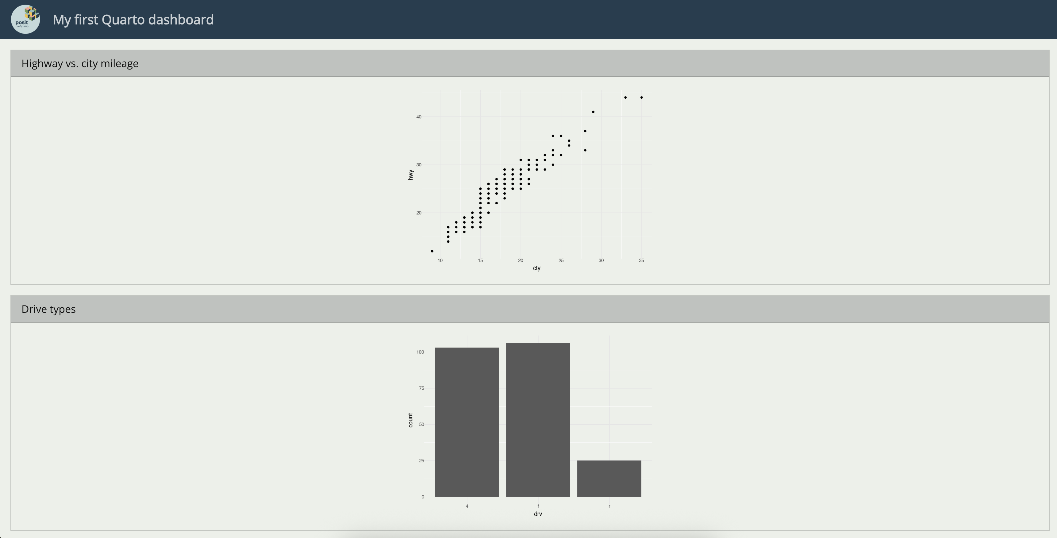
---
title: "My first Quarto dashboard"
format: dashboard
---
```{python}
from plotnine import ggplot, aes, geom_point, geom_bar
from plotnine.data import mpg
```
```{python}
#| title: Highway vs. city mileage
(
ggplot(mpg, aes(x = "cty", y = "hwy"))
+ geom_point()
)
```
```{python}
#| title: Drive types
(
ggplot(mpg, aes(x = "drv"))
+ geom_bar()
)
```
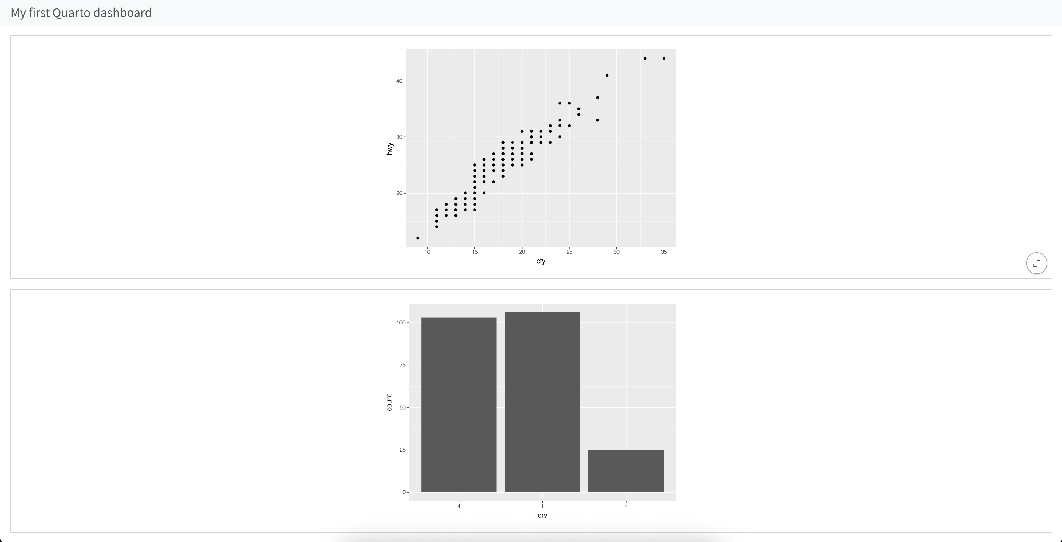
Steps 1 - 4
brand.yml works with dashboards too!
Rows
dashboard.qmd
---
title: "Rows"
format: dashboard
---

```{python}
from plotnine import ggplot, aes, geom_point, geom_bar
from plotnine.data import mpg
```

## Scatter

```{python}
#| title: Highway vs. city mileage
(
    ggplot(mpg, aes(x = "cty", y = "hwy"))
    + geom_point()
)
```

## Bar

```{python}
#| title: Drive types
(
    ggplot(mpg, aes(x = "drv"))
    + geom_bar()
)
```
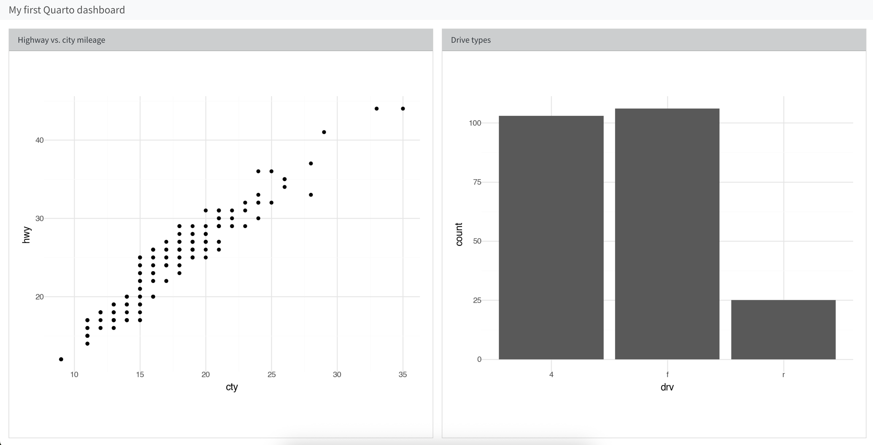
Columns
dashboard.qmd
---
title: "Columns"
format:
  dashboard:
    orientation: columns
---

```{python}
from plotnine import ggplot, aes, geom_point, geom_bar
from plotnine.data import mpg
```

## Scatter

```{python}
#| title: Highway vs. city mileage
(
    ggplot(mpg, aes(x = "cty", y = "hwy"))
    + geom_point()
)
```

## Bar

```{python}
#| title: Drive types
(
    ggplot(mpg, aes(x = "drv"))
    + geom_bar()
)
```
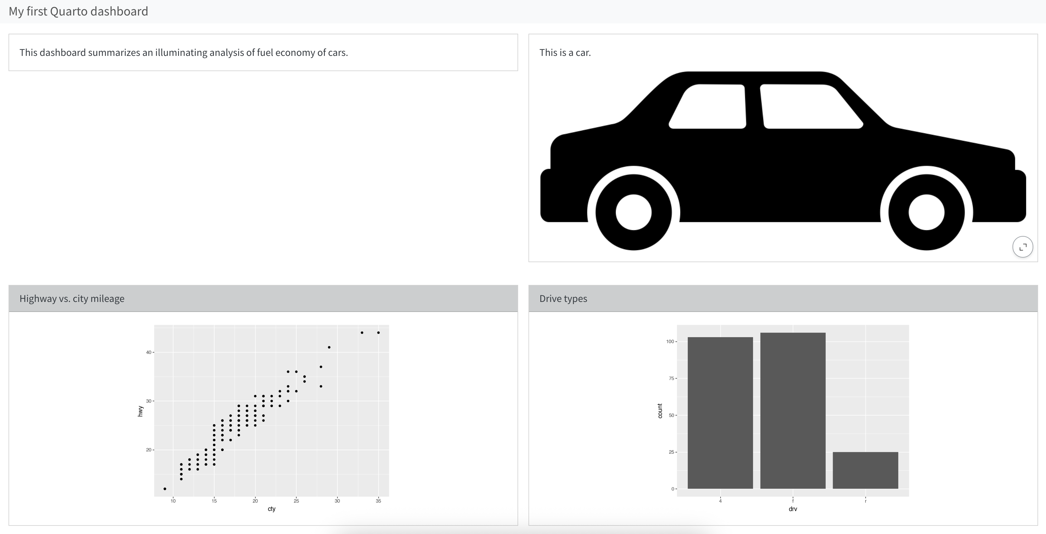
Rows, then columns
dashboard.qmd
---
title: "Rows, then columns"
format: dashboard
---
```{python}
from plotnine import ggplot, aes, geom_point, geom_bar
from plotnine.data import mpg
```
## Overview
###
This dashboard summarizes an illuminating analysis of fuel economy of cars.
###
This is a car.
{fig-alt="Illustration of a teal color car."}
## Plots
### Scatter
```{python}
#| title: Highway vs. city mileage
(
ggplot(mpg, aes(x = "cty", y = "hwy"))
+ geom_point()
)
```
### Bar
```{python}
#| title: Drive types
(
ggplot(mpg, aes(x = "drv"))
+ geom_bar()
)
```
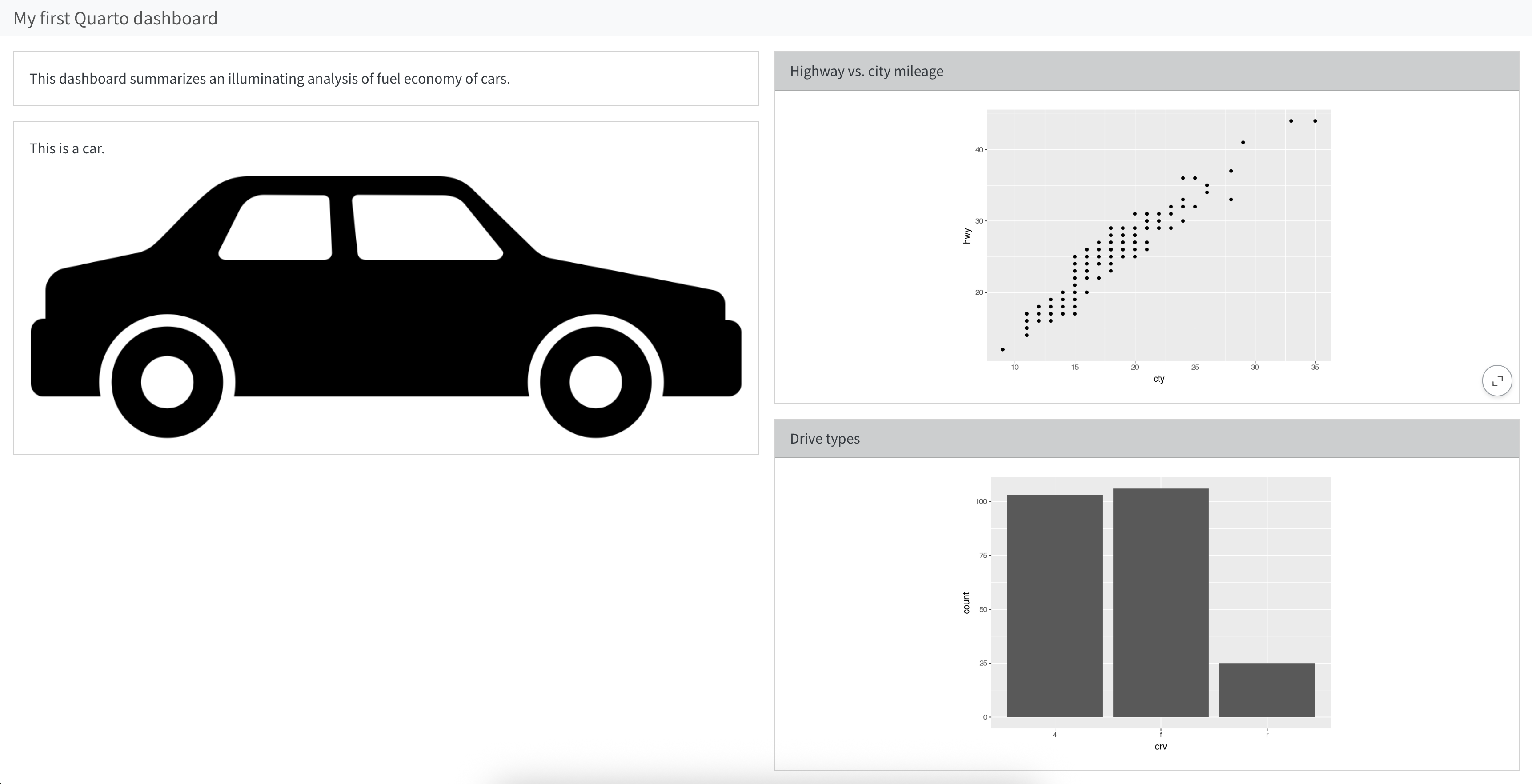
Columns, then rows
dashboard.qmd
---
title: "Rows, then columns"
format:
dashboard:
orientation: columns
---
```{python}
from plotnine import ggplot, aes, geom_point, geom_bar
from plotnine.data import mpg
```
## Overview
###
This dashboard summarizes an illuminating analysis of fuel economy of cars.
###
This is a car.
{fig-alt="Illustration of a teal color car."}
## Plots
### Scatter
```{python}
#| title: Highway vs. city mileage
(
ggplot(mpg, aes(x = "cty", y = "hwy"))
+ geom_point()
)
```
### Bar
```{python}
#| title: Drive types
(
ggplot(mpg, aes(x = "drv"))
+ geom_bar()
)
```
Your turn
Change the layout of your dashboard so that it looks like this:
05:00
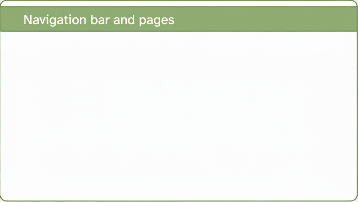
Navigation bar and pages
Icon, title, and author along with links to sub-pages if more than one page is defined.
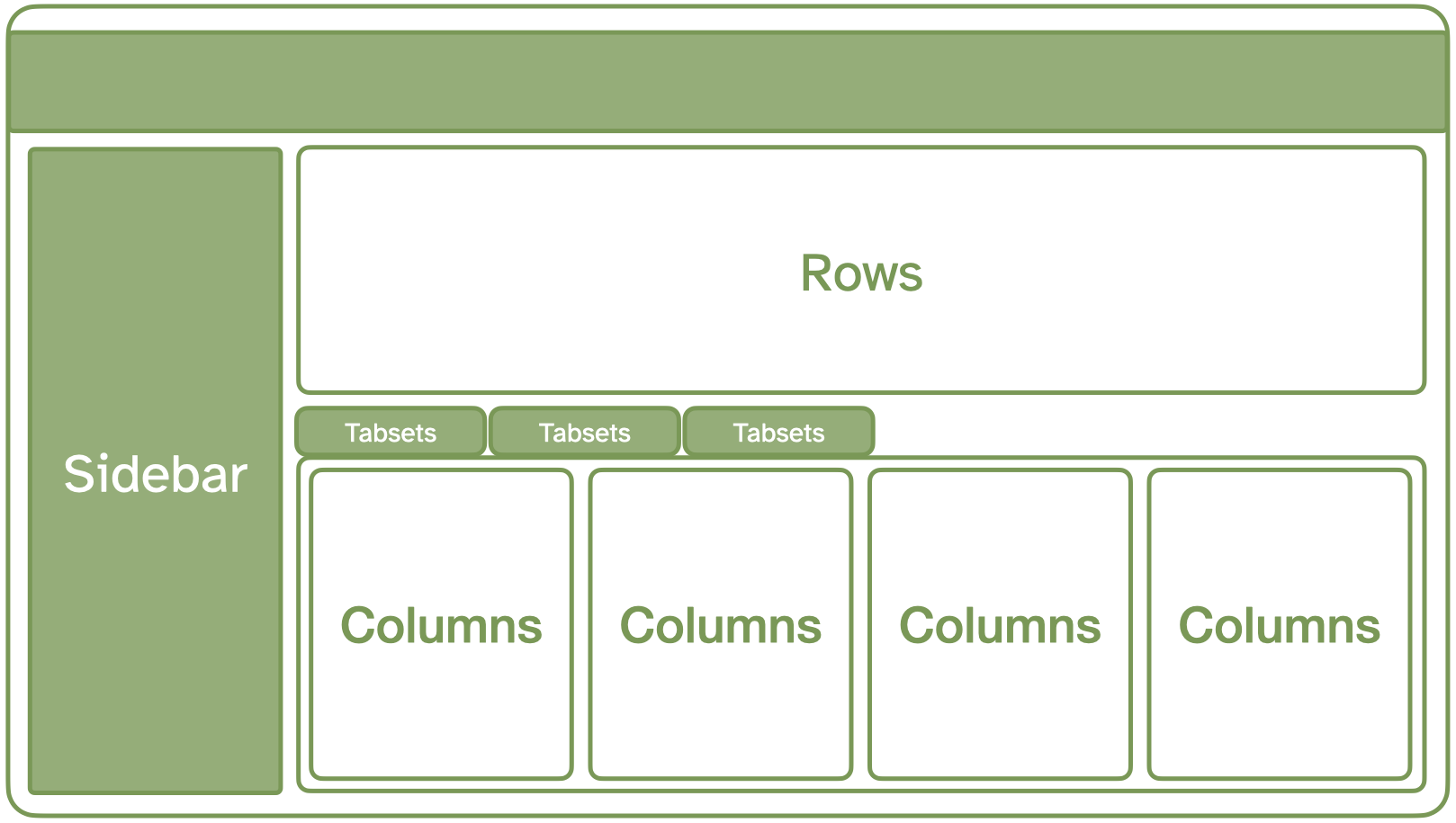
Sidebars, rows, columns, and tabsets
Rows and columns using markdown headings, with optional attributes to control height, width, etc. Sidebars, mostly used for for interactive inputs. Tabsets to further divide content.
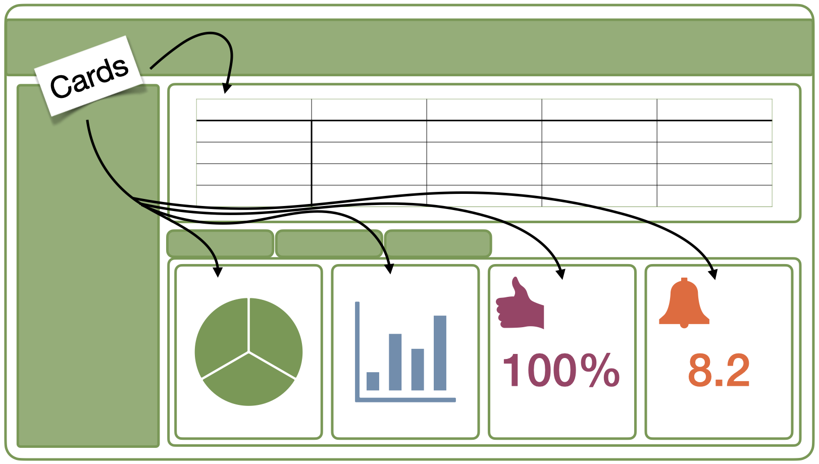
Cards
Cards are containers for code cell outputs (e.g., plots, tables, value boxes) and free form markdown text. The content of cards typically maps to cells in your notebook or source document.
Your turn
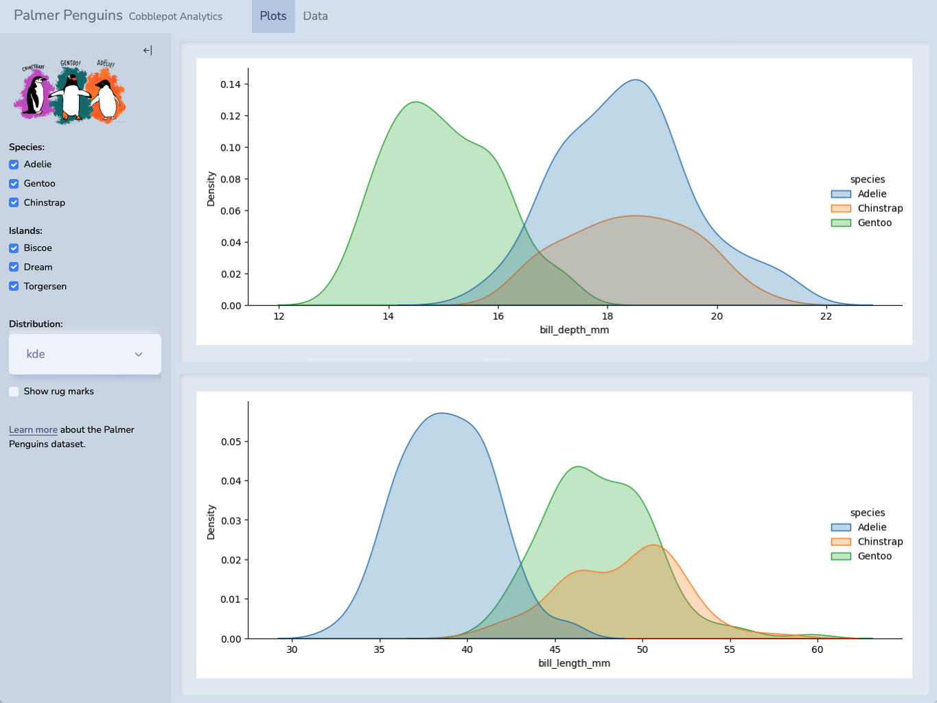
Take a look at the Tabsets documentation on the Quarto website.
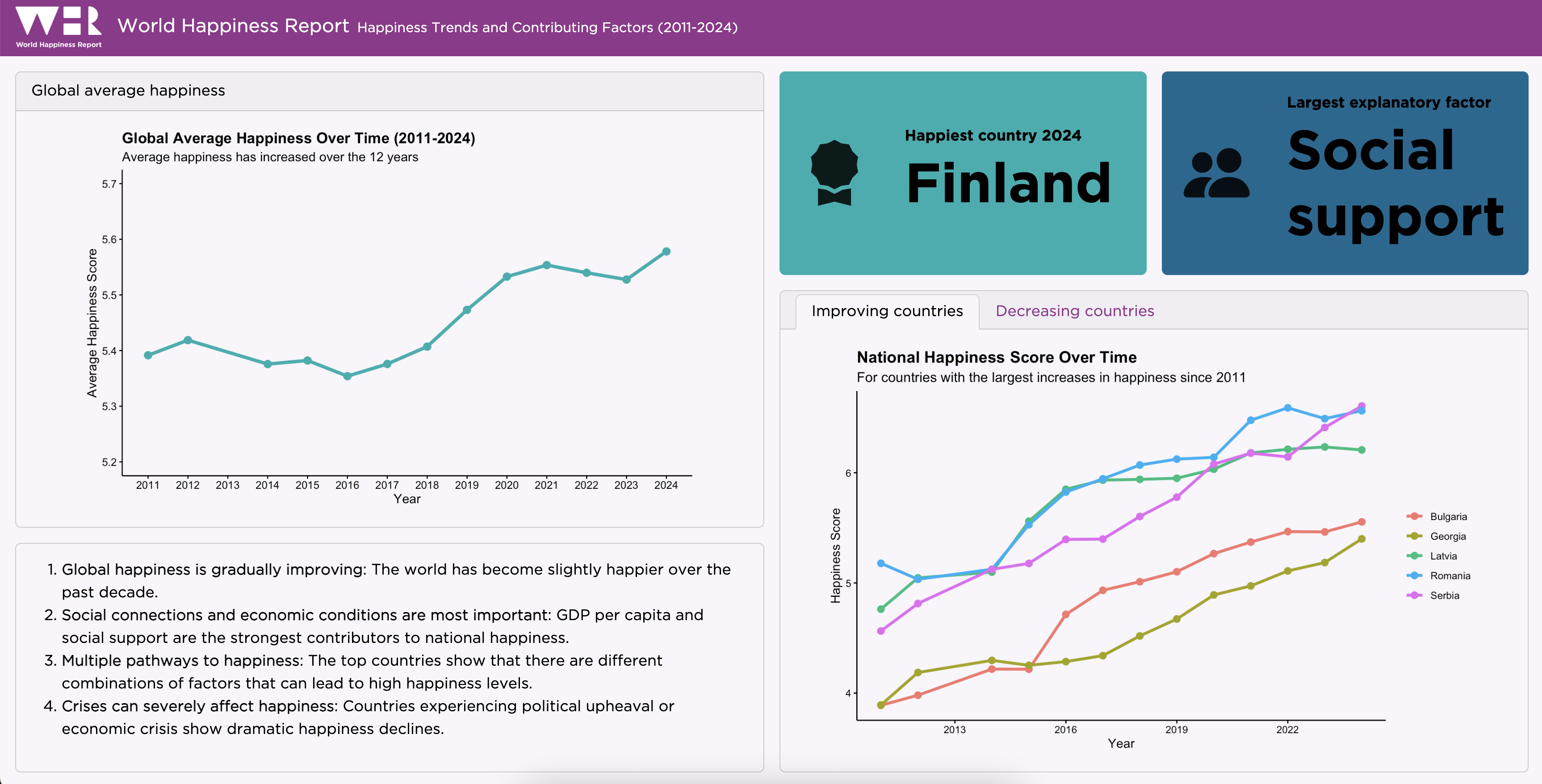
Move the plots showing the countries that increased and decreased in happiness into a tabset. Your dashboard should then look like this:
05:00
Tabsets
Each card within a row/column or each row/column within another becomes a tab:
dashboard.qmd
---
title: "Tabsets"
format: dashboard
---
```{python}
from plotnine import ggplot, aes, geom_point, geom_bar
from plotnine.data import mpg
```
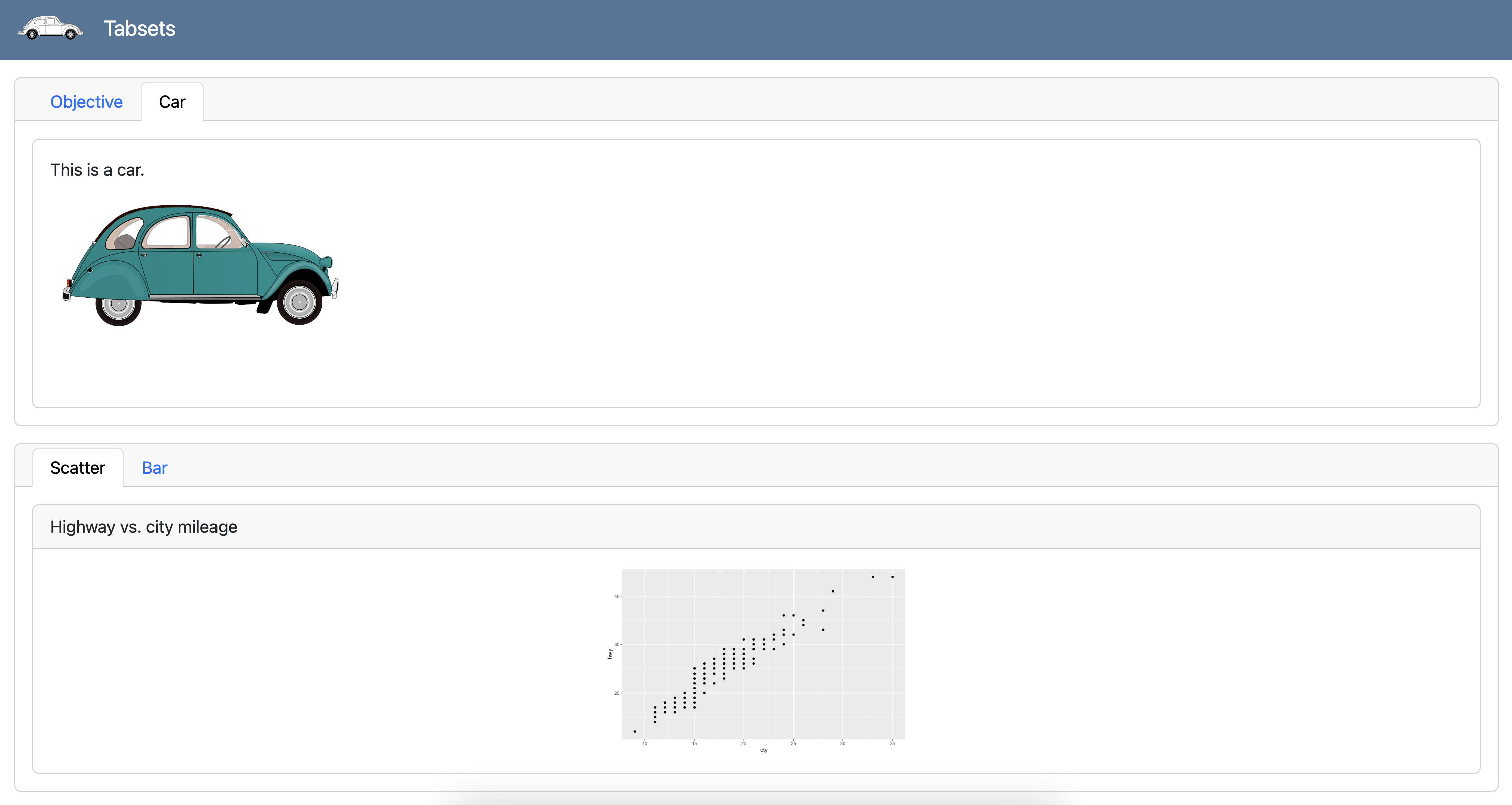
## Overview {.tabset}
### Objective
This dashboard summarizes an illuminating analysis of fuel economy of cars.
### Car
This is a car.
{fig-alt="Illustration of a teal color car." width="299"}
## Plots {.tabset}
### Scatter
```{python}
#| title: Highway vs. city mileage
(
ggplot(mpg, aes(x = "cty", y = "hwy"))
+ geom_point()
)
```
### Bar
```{python}
#| title: Drive types
(
ggplot(mpg, aes(x = "drv"))
+ geom_bar()
)
```
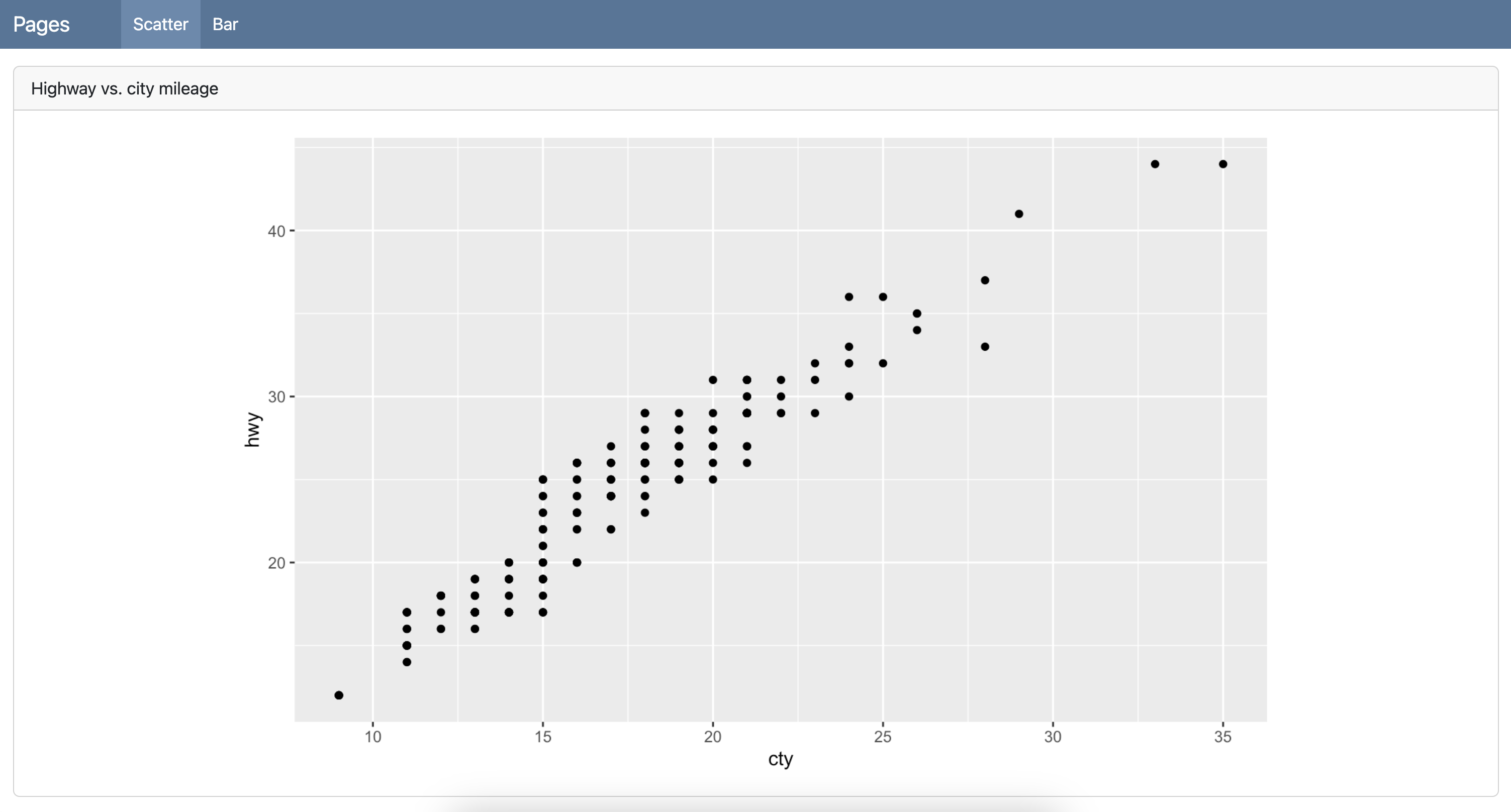
Pages
dashboard.qmd
---
title: "Pages"
format: dashboard
---
```{python}
from plotnine import ggplot, aes, geom_point, geom_bar
from plotnine.data import mpg
```
# Scatter
```{python}
#| title: Highway vs. city mileage
(
ggplot(mpg, aes(x = "cty", y = "hwy"))
+ geom_point()
)
```
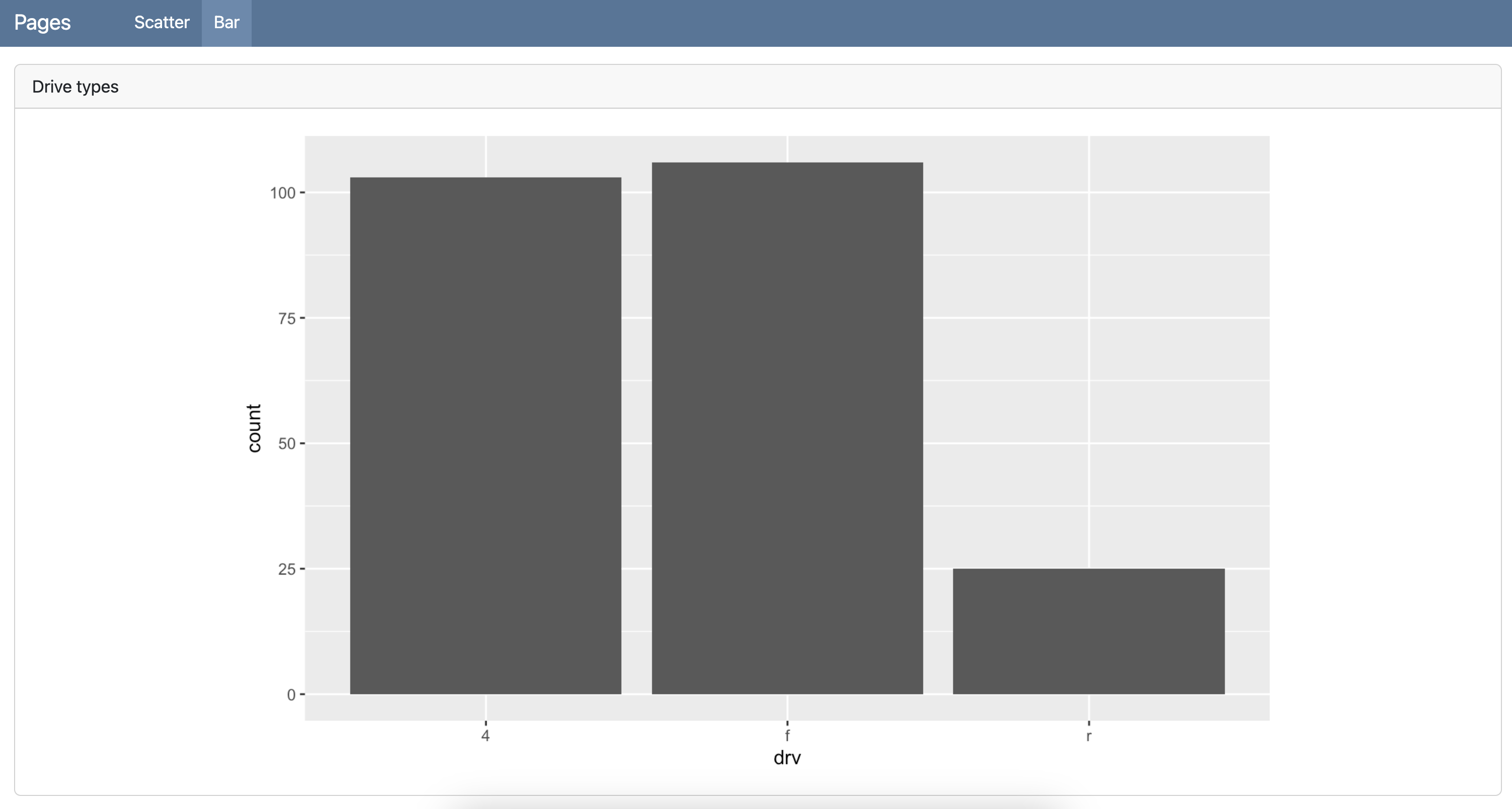
# Bar
```{python}
#| title: Drive types
(
ggplot(mpg, aes(x = "drv"))
+ geom_bar()
)
```
Pages
dashboard.qmd
---
title: "Pages"
format: dashboard
---

```{python}
from plotnine import ggplot, aes, geom_point, geom_bar
from plotnine.data import mpg
```

# Scatter

```{python}
#| title: Highway vs. city mileage
(
    ggplot(mpg, aes(x = "cty", y = "hwy"))
    + geom_point()
)
```

# Bar

```{python}
#| title: Drive types
(
    ggplot(mpg, aes(x = "drv"))
    + geom_bar()
)
```
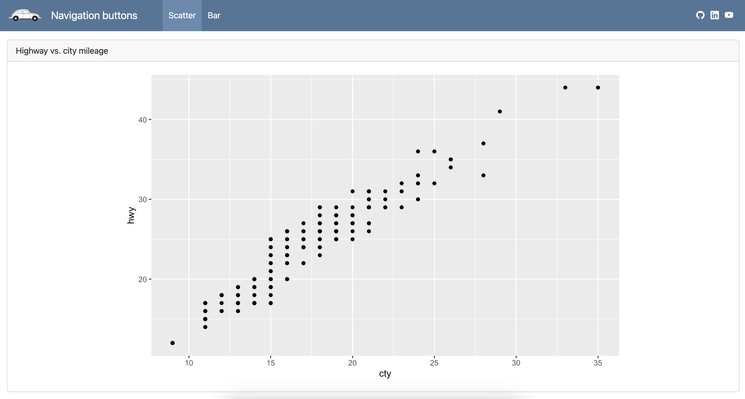
Navigation buttons
dashboard.qmd
---
title: "Navigation buttons"
format:
  dashboard:
    nav-buttons:
      - icon: github
        href: https://github.com/quarto-dev/quarto-cli
        aria-label: GitHub
      - icon: linkedin
        href: https://www.linkedin.com/company/posit-software/
        aria-label: LinkedIn
      - icon: youtube
        href: https://youtube.com/
        aria-label: YouTube
---

```{python}
from plotnine import ggplot, aes, geom_point, geom_bar
from plotnine.data import mpg
```

# Scatter

```{python}
#| title: Highway vs. city mileage
(
    ggplot(mpg, aes(x = "cty", y = "hwy"))
    + geom_point()
)
```

# Bar

```{python}
#| title: Drive types
(
    ggplot(mpg, aes(x = "drv"))
    + geom_bar()
)
```
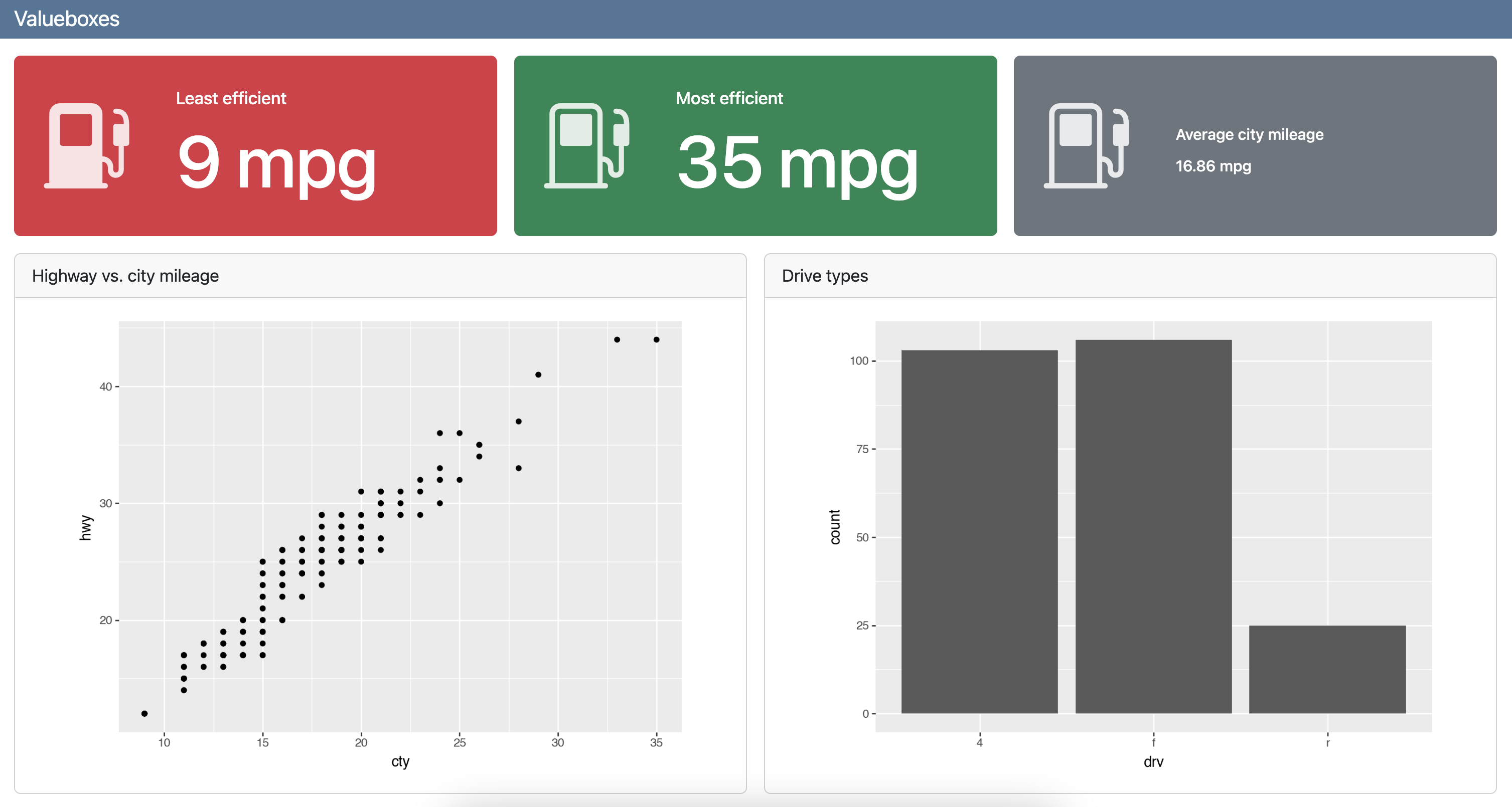
Value boxes
dashboard.qmd
---
title: "Valueboxes"
format: dashboard
---

```{python}
from plotnine import ggplot, aes, geom_point, geom_bar
from plotnine.data import mpg
```

## Value boxes {height="25%"}

```{python}
#| label: calculate-values
lowest_mileage_index = mpg['cty'].idxmin()
lowest_mileage_car = mpg.iloc[lowest_mileage_index]
lowest_mileage_cty = mpg.loc[lowest_mileage_index, 'cty']

highest_mileage_index = mpg['cty'].idxmax()
highest_mileage_car = mpg.iloc[highest_mileage_index]
highest_mileage_cty = mpg.loc[highest_mileage_index, 'cty']

mean_city_mileage = mpg['cty'].mean()
rounded_mean_city_mileage = round(mean_city_mileage, 2)
```

```{python}
#| content: valuebox
#| title: "Least efficient"
#| icon: fuel-pump-fill
#| color: danger
dict(
  value = str(f"{lowest_mileage_cty} mpg")
)
```

```{python}
#| content: valuebox
#| title: "Most efficient"
dict(
  icon = "fuel-pump",
  color = "success",
  value = str(f"{highest_mileage_cty} mpg")
)
```

::: {.valuebox icon="fuel-pump" color="secondary"}
Average city mileage

`{python} str(rounded_mean_city_mileage)` mpg
:::

## Plots {height="75%"}

```{python}
#| title: Highway vs. city mileage
(
    ggplot(mpg, aes(x = "cty", y = "hwy"))
    + geom_point()
)
```

```{python}
#| title: Drive types
(
    ggplot(mpg, aes(x = "drv"))
    + geom_bar()
)
```
Your turn
Add two value boxes to your dashboard, above the tabset, so that your dashboard looks like this:
Use the brand colors. You can either hard-code the value box values (“Finland” and “Social support”) or calculate them using the data.
05:00